According to Statista, the average cart abandonment rate currently stands at 77%. For some industries, that figure is even higher, up to 82% for travel businesses for example. The sobering reality is that customers leave behind an estimated $4.6 trillion on the table each year.
Yet, in all these somewhat alarming statistics, there is some good news. A Business Insider study found that $2.75 trillion, more than half the $4.6 trillion figure, is recoverable. To give it some perspective, the GDP of the world’s fifth largest economy, the UK, is $2.5 trillion.
For proactive and savvy business owners, abandoned carts present a real opportunity. These customers have clearly demonstrated a strong interest in your products and are hot leads. Therefore, you should do whatever it takes to win them back.
With around 2 billion e-commerce customers around the world in 2019, coming up with a way to recover those carts will be evermore lucrative.
This guide will take you through all the elements you need to consider when setting up your strategy for recovering abandoned carts.
Why People Abandon Their Carts
Before we dive into how to recover carts, we need to look at the reasons why people leave before completing their purchase. As you’d expect, the picture is a little complex.
But there are some important takeaways.
Shipping and Extra Costs
This has emerged as one of the top reasons why people prematurely leave their carts. As one study suggests, 23% of customers abandon the process due to shipping and extra costs. It’s not always related to the cost of shipping either.
Next-day, and even same-day, delivery are an increasingly common sight on e-commerce stores. So if you do not match these expectations, then shoppers will go elsewhere.
Comparing Prices
One of the other driving factors behind abandoned carts is the nature of online shopping. The Internet has made it easier than ever before for shoppers to conduct research and compare prices. Surveys show up to 80% of customers do this online. They may even decide to make the purchase offline, in physical stores.
Technical Issues
While this accounts for a relatively small proportion of abandoned carts, around 4%, this could be your most promising segment. If this is the only reason they haven’t completed their purchase, then they are ripe for recovery,
This means it’s critical to ensure your site is smooth and easily navigable. Be quick to identify any potential issues and fix them. It’s worth noting too, that complicated checkout processes can add to these problems. Many stores now offer single page checkouts or a progress bar, letting shoppers know which stage they’re at.
While some of these technical issues could be down to poor internet connections, you should do whatever it takes to minimize the risk.
Just Browsing
Many visitors to your e-commerce store are simply browsing, accounting for around 34% of abandoned carts. These often account for “one-off” purchases, such as houses, vacations, and cars. One study found that families often take several months before completing an automotive purchase.
With this segment, you should focus on being informative and useful. There are many factors behind large purchases and people naturally need time and information to consider them all. Provide these elements and you will increase the likelihood of staying in their minds.
How to Recover Abandoned Carts
Now that you understand some of the main reasons behind abandoned carts, you’ll be ready to win them back.
The key is to take a multi-channel, personalized approach. Being proactive, open, and engaging will deliver results. Having a well-organized strategy in place will further improve the recovery rate.
Abandoned Cart Emails
This is one of the biggest benefits of the service we offer at MageMail. Many of our clients use our automated emails to recover abandoned carts, with some success.
(Source: Author’s screenshot)
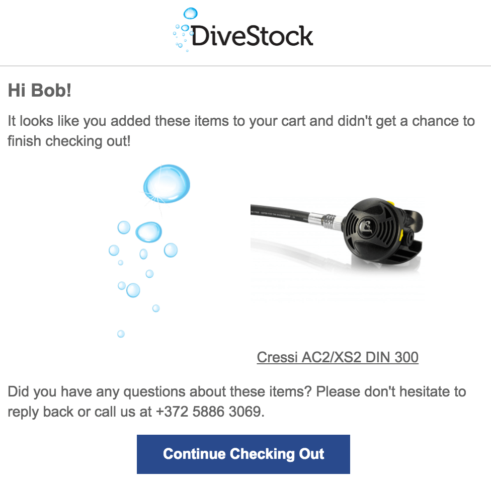
One of our clients, DiveStock used this email format to customers who failed to complete their purchases. Direct, simple, and scannable, this email generated 35% of the store’s total revenue over a 90 day period. Behind the simplicity, there are a number of elements that create a successful email marketing strategy:
Timing and Frequency of Abandoned Cart Emails
The first thing is to strike while the lead is still hot. If you send the first abandoned cart email a week later, or even the next day – it’s too late. The customer will have already moved on, if not forgotten about the purchase altogether.
This is backed by studies which show 72% of customers who purchase from cart recovery emails do so within the first 24 hours. At MageMail, you can connect your Magento e-commerce store with your email system to automate the entire process.
By sending the first email quickly after the shopper has left the checkout process, you have the opportunity to “nudge” them in the right direction. With the product fresh in their minds, they will be more receptive to persuasion.
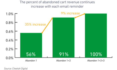
Another factor to bear in mind is frequency. Many marketers have the understandable concern about bombarding their customers. However, in the case of abandoned carts, brands who send three emails generate 44% higher revenue than those who just send one. This is neatly demonstrated in the graph below:
(Source: Cheetahdigital.com)
Takeaway: Act quickly and use automated emails to reach out to your hot leads within the first hour. If your customers do not act on the first email, then try again a couple more times over the following week. Magento store merchants can automate the entire process with MageMail.
Best Abandoned Cart Subject Lines
The reality is that first impressions do count. Scientists have found that humans take just a tenth of a second to judge trustworthiness.
Before your subscribers open it, they will have already formed a perception of your email from the subject line. So, even if the content inside was carefully crafted and designed perfectly to recover an abandoned cart, it will be worthless if it’s never opened.
To further underline the value of making that great first impression, 47% of recipients open emails based on the subject line alone.
We previously covered this topic in a recent blog post. We identified the following six principles that apply to all subject lines:
- Personalize: This goes beyond simply using the recipient’s name. Ensure the subject line is tailored to their interests or purchase.
- Focused: A good subject line is a short one, so you need to be specific and captivating with it. Focus on one aspect rather than trying to cram the entire content into a single line.
- Inform and Build Trust: It can be tempting to overhype your email with an exciting subject line. However, this can be misleading and turn off your subscribers, which will affect your open rate.
- Length Matters: As we increasingly use mobile devices to check emails, character count does come into play. Aim for a subject line with no more than six words to ensure it doesn’t get cut off by email providers.
- Give a Reason: With the average working adult receiving over 120 emails a day, people need a reason to open yours. The subject line is the perfect place to give them that reason.
- Test: As with every other element of email marketing, the best way to find out what works is testing. Segment your list so you can split-test your subject lines and see which has the higher open rate.
Trying to fit all of these principles into a subject line of no more than 20 characters can be a challenge. As ever, the key is simplicity. Let’s take a look at some examples below:
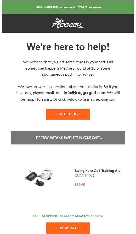
Frogger – Oops, you forgot something.
(Source: Author’s screenshot)
This is an example from one of our clients, golf accessories store, Frogger.The subject line is short, direct, and personal. The company takes a friendly tone straight away, and the slight humor also helps. Shoppers can often get distracted during the checkout process, whether they’re visiting other sites or simply putting the kettle on.
Frogger’s subject line is designed to offer a gentle reminder within the first hour. There’s little doubt the subscriber will remember what that “something” is.
The use of “Oops, you…” gives the email a personalized feel. Although a name can help from time to time, it’s important to manage it. Hearing your name over and over again can get a little creepy.
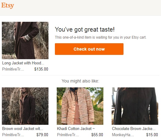
Etsy – Whoa. You haven’t bought that yet?
(Source: Author’s screenshot)
The use of “Whoa” adds a sense of urgency, imploring the subscriber to open their email. Etsy is an e-commerce platform for small, independent retailers and has a reputation for fun and funky products. As a result, the brand can use this kind of informal language that others may not be able to get away with.
Once again, it’s short so mobile users will be able to view the whole line and the use of “You” adds that crucial personal touch. Complimenting the customer on their “great taste” within the email body doesn’t do any harm either.
Chubbies – Clocking in

(Author’s screenshot)
Here the shorts brand, Chubbies, embrace simplicity and intrigue. It’s perfect for a second or third email if the subscriber hasn’t taken action on the first. The company enjoys a casual image, and “Clocking in” is an excellent, relaxed line to use. The recipient may not necessarily remember the product by this point, so in order to find out more, they have to open the email.
From that point onward, you can let the content and email design do the work.
Takeaway: Subject lines matter. To maximize the potential of your cart recovery emails, you need to get subscribers to open them in the first place. Remember the six principles, including personalization, length, and trust. There’s a fine line between attention-grabbing and over-hyping. Focus on what the email is about, and deliver the message is a short and coherent way.
There’s no need to over-complicate. As you can see from the three examples, simple, single-message subject lines work best.
Conversion-Focused Email Design
Much like the subject line, direct and simple is the name of the game. The design should ensure focus on converting potential buyers into customers.
These subscribers have clearly demonstrated a keen interest in the products, so they often just need a nudge. The email design should reflect this.
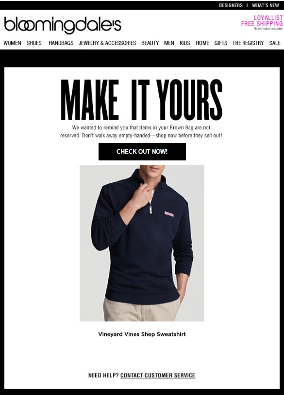
American department store chain, Bloomingdale’s embrace this simple approach, with this email:
(Source: Author’s screenshot)
The brand uses the image of the product left in the cart, with the headline “Make It Yours.” The design and size of the font play a key role, driving home the purpose of the email. There’s minimal extra content too, so the recipient’s focus is entirely on the sweatshirt they nearly bought.
The heading is important too. It’s similar to the website, with the navigation bar along the top and the brand design. It ensures the subscriber immediately feels familiar with the email and helps to build trust.
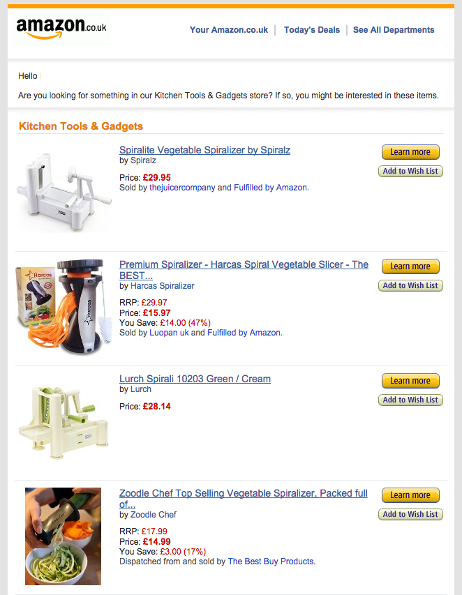
E-commerce giant Amazon is a master at this game. It knows one of its selling points – the sheer variety of products.
This email is a clear demonstration of Amazon playing to its strengths:
(Source: Author’s screenshot)
You will notice that Amazon automatically sent this email after browsing the Kitchen Tools and Gadgets section. I didn’t even need to begin the buying purchase. This enables the e-commerce giant to recommend similar products I might be interested in.
The list design also ensures the recipient can easily scan all the necessary information and images. Once again, the focus is on the products themselves and nothing else.
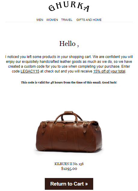
In terms of design, call-to-action (CTA) buttons play a significant role. You need to ensure it stands out, and entice your subscribers to complete their purchase.
(Source: Author’s screenshot)
Leather goods store Ghurka takes a hands-on approach to customer service in general, and this cart recovery email is no different. Its stand out feature is the bold CTA button at the bottom. As well as offering a discount, the store makes it clear where to go. By using a different color from the rest of the email, Ghurka is showing exactly where the recipient should go next.
Takeaway: The importance of email design cannot be overstated. You need to consider imagery, fonts, and CTAs. The purpose is to focus your subscribers to the content and message, which is to complete their purchase.
By smartly utilizing design, you can nudge your potential buyers to becoming customers. Simply using bright colors alone will not work. The trick is to be selective, minimize any distractions, and make it as easy as possible for the subscriber to complete the purchase.
Email Content
With cart recovery emails, the tone is key. It needs to have urgency, focus, and be direct. Yet, it also needs to be friendly, engaging, and open.
The role of content is to set the tone for the relationship with your subscribers. No-one likes the feeling they are being forced into a corner. And avoid the temptation to over-promise, which will cause problems further down the line.
Imagine if you’re a customer who just left their cart, and your received an email from the store. Would it need anything more than a brief, friendly message and the image of the product?
Sometimes, a nudge is all you need to complete the purchase.
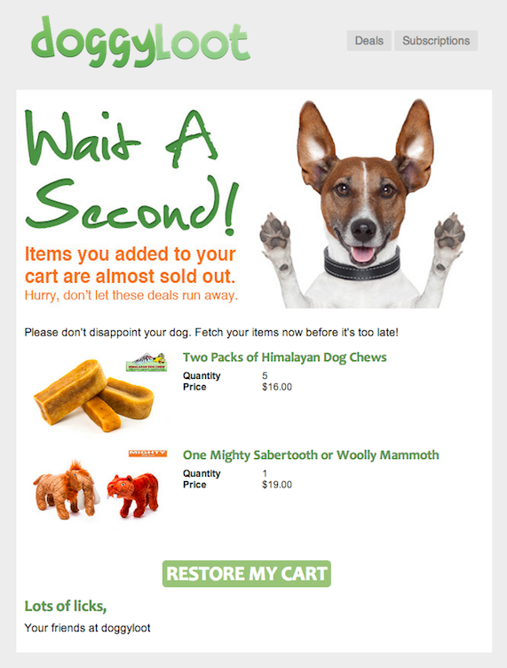
It is a safety first albeit approach, albiet one that works. Let’s take a look at an example from pet store, DoggyLoot:
(Source: Author’s screenshot)
As you can see, there’s minimal content but each word adds urgency for the recipient. The pet store also taps into the emotive connection between the owner and their dog. “Please don’t disappoint your dog. Fetch the items now before it’s too late!”
Supported by the image of an excited dog, how can you say no to this?
This kind of email does not work for every brand. Not many audiences will have such an emotional connection to the products as pet owners, aside from parents. With others, this kind of content could be considered as pushy or desperate.
For other stores, a more restrained tone is required:
(Source: Author’s screenshot)
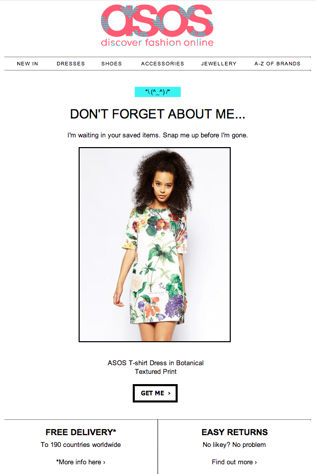
Leading fashion store ASOS follows the simple formula, in a slightly more sedate manner than DoggyLoot. Yet it still uses emotive language with a hint of urgency, this time in a tone that suits its audience.
Like many cart recovery emails, the brand lets the image do the selling. After all, the subscriber has clearly demonstrated a strong interest in the product, so reminding them in this way is highly effective.
Along the bottom of this email is reassuring information about free deliveries and easy returns. It’s all designed to make shoppers comfortable with buying products through ASOS.
Takeaways: You need to consider your audience when it comes to content. The tone should always be engaging and friendly. Don’t be afraid to use a little bit of humor to add a personal touch to the email. As ever, keep the content consistent with the message you want to send out, and focus on one message which should be:
“Come back to the cart and complete your purchase.”
Using Special Offers and Other Incentives
One of the most popular methods of winning back abandoned carts is offering discounts or special offers.
From our analysis of the top performing abandoned cart emails, the majority of them offered a discount – predominantly in their second abandoned cart email.
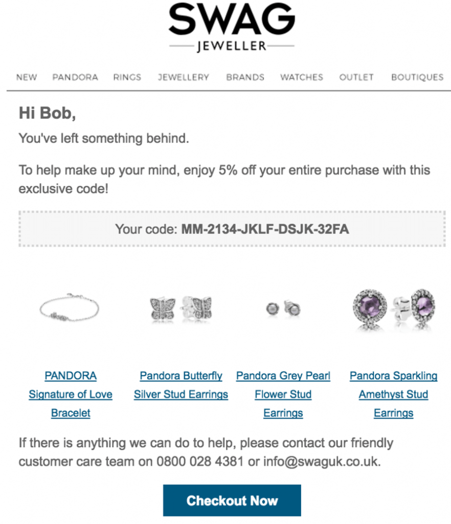
Here’s a case study we looked at in an earlier blog post using one of our clients, Swag Jeweller
(Source: Author’s screenshot)
Another simple, but a highly effective example of email copy. Two lines of text, product images, a clear outline of the 5% discount coupon code and the call to action button leading them back to their shopping cart. This is their last email in their three-email abandoned cart funnel.
In a typical email funnel, we would typically see the following trend:
- Revenue from email 1: 60% total abandoned cart email revenue
- Revenue from email 2: 30% total abandoned cart email revenue
- Revenue from email 3: 10% total abandoned cart email revenue
The sales revenue goes down dramatically for every email sent.
However, for Swag Jeweller, we see the following trend:
- Revenue from email 1: 60% total abandoned cart email revenue – no discount
- Revenue from email 2: 19% total abandoned cart email revenue – no discount
- Revenue from email 3: 21% total abandoned cart email revenue – 5% discount
The added discount made sales revenue from email 3 greater than email 2. The added discount code gave an extra boost in buyer’s intent, maximizing their revenue potential.
You will notice that the store did not use the discount until the very last email, which was a deliberate move. If you make the offer straight away, customers will learn to abandon their cart and wait for a special deal. This would lead to a loss of potential revenue rather than the revenue gained.
After all, the store still made the vast majority of it’s recovered revenue with the first email, without a discount.
Treat this method as your trump card, the last resort. And also ensure such a deal will not affect your bottom line.
Takeaways: This is not a method you should deploy straight away. Try enticing them back with great emails and gentle reminders first. Our results have proven the first round of emails deliver the best returns, with or without discounts.
If your subscribers haven’t taken the bait after the second email, then it’s time to give it one final shot, with a discount. This is a great way to win over reluctant, first-time buyers.
Website Optimization
Of course, email marketing isn’t the only strategy available to you. In fact, it should be part of a holistic, integrated system that aims to minimize the loss of revenue through abandoned carts. The first port of call is your website. In this section, we’re going to look at all the elements that come into play:
Improving Site Navigation
The point of e-commerce stores is to sell your products, so make it as easy as possible for your visitors to find them. Once again, simplicity comes into play here. You should aim to limit the number of clicks the customer needs to make before completing the purchase.
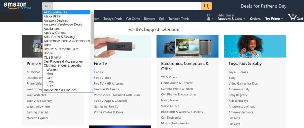
Amazon has a vast catalog of products, across hundreds of categories and sub-categories. So, in order to enable visitors to find what they are looking for, the e-commerce giant has come up with an excellent search feature:
(Source: Amazon.com)
From the homepage, you can either jump straight into the relevant department or use its comprehensive search facility. The idea is to enable shoppers to quickly navigate their way through the site to the relevant pages.
Amazon also takes advantage of key events, like Father’s Day. It knows a lot of shoppers will be looking for gifts, and on the homepage once again, the company provides a one-click route in:
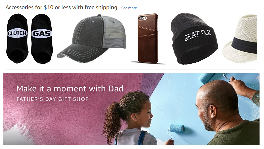
(Source: Amazon.com)
By making your site easily navigable, you will direct shoppers to the products they are interested in. With a smooth journey, the buyer will feel confident with your store and less likely to abandon their cart.
Takeaways: The onus here is to prevent carts from being left behind in the first place. Customers have plenty of options online, so your site needs to stand out from your competitors. One of the best ways of doing this is using smart design to make your site easily navigable. Use different categories for your products but don’t overdo it.
Too many will lead visitors feeling confused about which category they should look into. Guide them to the right place rather than giving them too much choice. The search facility is also a pivotal factor for many e-commerce stores. Ensure it works as you intend to, test it out regularly and quickly fix any issues.
Improve Your Checkout Process
The checkout process can be difficult to get right. You need to gather all the required information – address, card details, and delivery, but you also want to make it seamless for your customers.
Amazon’s main American rival, Walmart recently revamped its site and is now one of the best in e-commerce.
Once I find my product, I click to add it to my cart – at which point this pops-up:
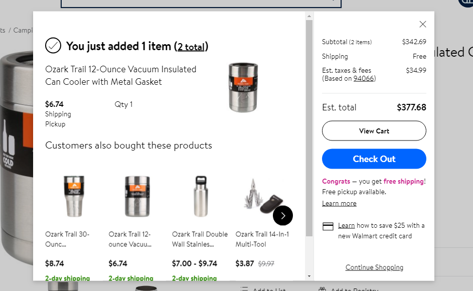
(Source: Walmart.com)
I’ve added it to my cart and now I have the option to carry on shopping or go to the checkout. Having bought everything I needed, I go for the latter option, which takes me to this page:
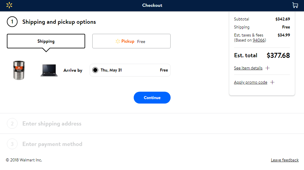
(Source: Walmart.com)
The design is clean, crisp, and concise. It displays all the shopper needs including shipping options, overall costs, and the number of stages left. As you can see, it’s a straightforward three-step process, with the total cost displayed at all times.
This transparency prevents any nasty surprises at the end, and it provides free shipping. For smaller stores, with narrower margins, this could be a costly service to provide. Therefore, consider offering free delivery with a minimum order value such as $50 or $100. The key is to provide this option to your customers.
You should also provide different payment options:
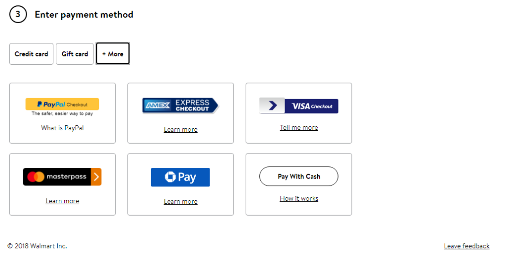
(Source: Walmart.com)
While 70% of e-commerce customers still prefer to use credit or debit cards to pay for purchases online, 39% say they’re happy to pay through services like PayPal. Additionally, many stores now enable customers to pay with gift cards.
By making all the main payment methods available, you will once again be minimizing the risk of cart abandonment.
Takeaways: The checkout is the final stage but it’s also one of the most important. The process should be smooth and secure. The customer needs to feel confident about sharing their private data with you. It’s a good idea to be transparent at all times with the total costs and have a breakdown explaining them,
If you can afford it, it’s strongly recommended to offer free shipping. It can make all the difference for customers. At the very end, demonstrate you can be flexible in terms of payment methods. In today’s increasingly digitalized world, there are more ways to pay than ever before.
Mobile Commerce
One of the hot trends in e-commerce has been the rise of shopping on mobile devices. In the United States, statistics show that “m-commerce” was already responsible for 34.5% of all online sales in 2017. By 2021, this figure is set to rocket to 54%.
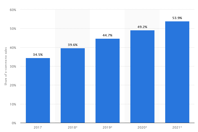
(Source: Statista.com)
So, if your site is not mobile friendly already, then you could be losing a lucrative amount of revenue. We covered this topic in a previous blog post.
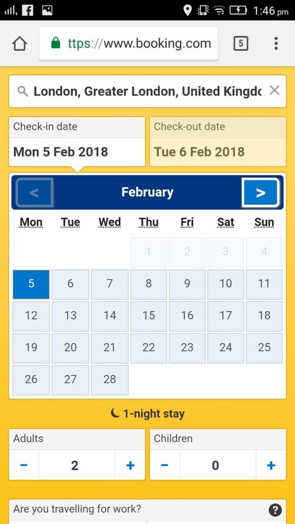
(Source: Booking.com)
This search page from Booking.com is a great example of how brands are optimizing their mobile sites. The oversized format and minimal content make it easy for the user to select their options and navigate through the process.
A challenge with m-commerce apps is image display. Outdoor apparel brand, REI makes product images the central part of product-pages for an almost full-screen experience:
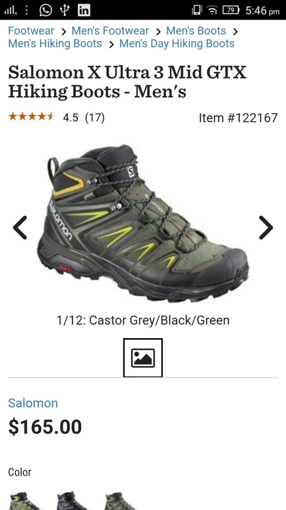
(Source: Rei.com)
This leads to an image being high-resolution enough for mobile users to really see the detail. And details matter. Make it as easy as possible for shoppers to see what they intend to purchase and you’re bound to drive conversion rates.
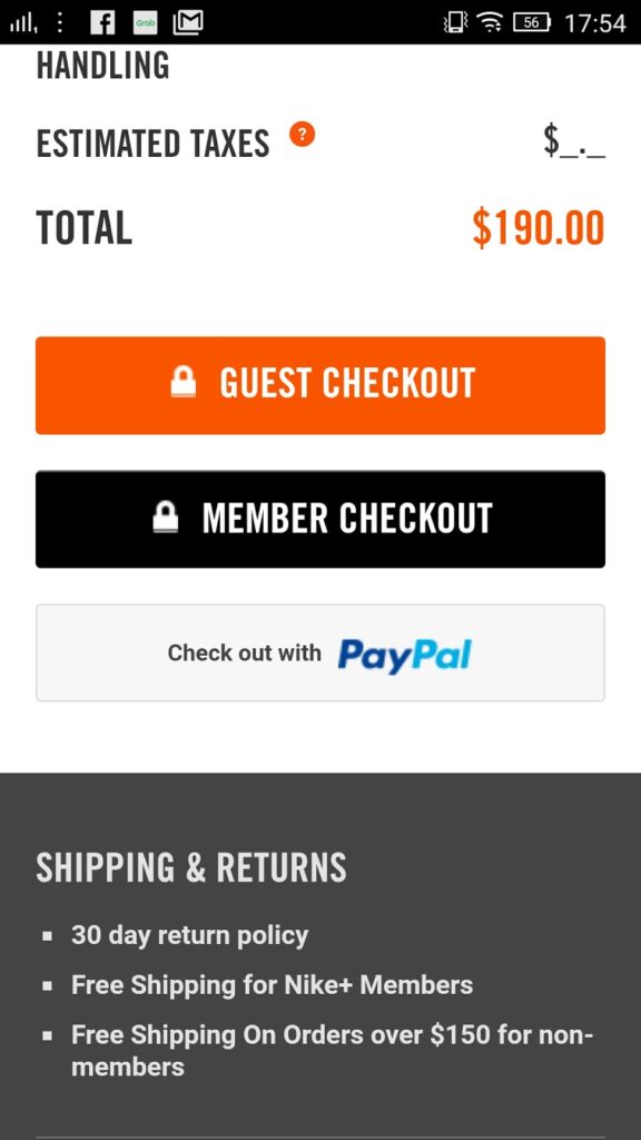
The mobile checkout process is another important step in the customer journey. Nike, ranked number five in the Baymard rankings for mobile-friendly sites, nail this process:
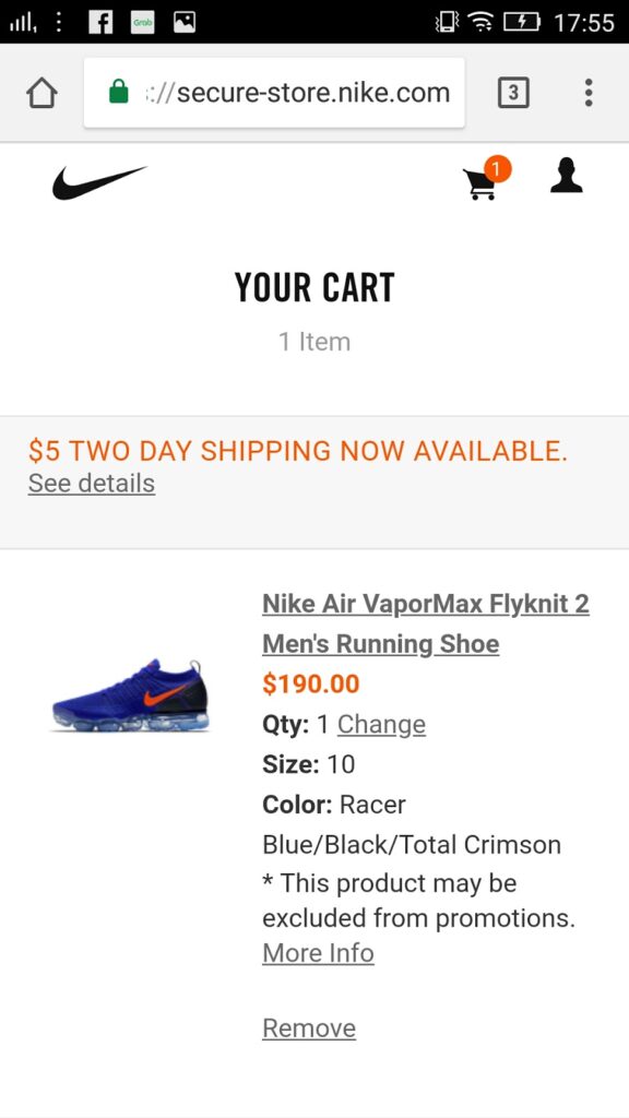
(Source: Nike.com)
After easily navigating through Nike’s mobile site, I decide to select a pair of sneakers. Taken straight to my cart, I can see all the information I need to check the product.
Scrolling down the page, and you’ll see the following options:
(Source: Nike.com)
Once more, you see the PayPal option as a payment method. You can also checkout as a guest, while Nike points out the benefit of free shipping for members. There’s also a reassurance of a 30-day return policy.
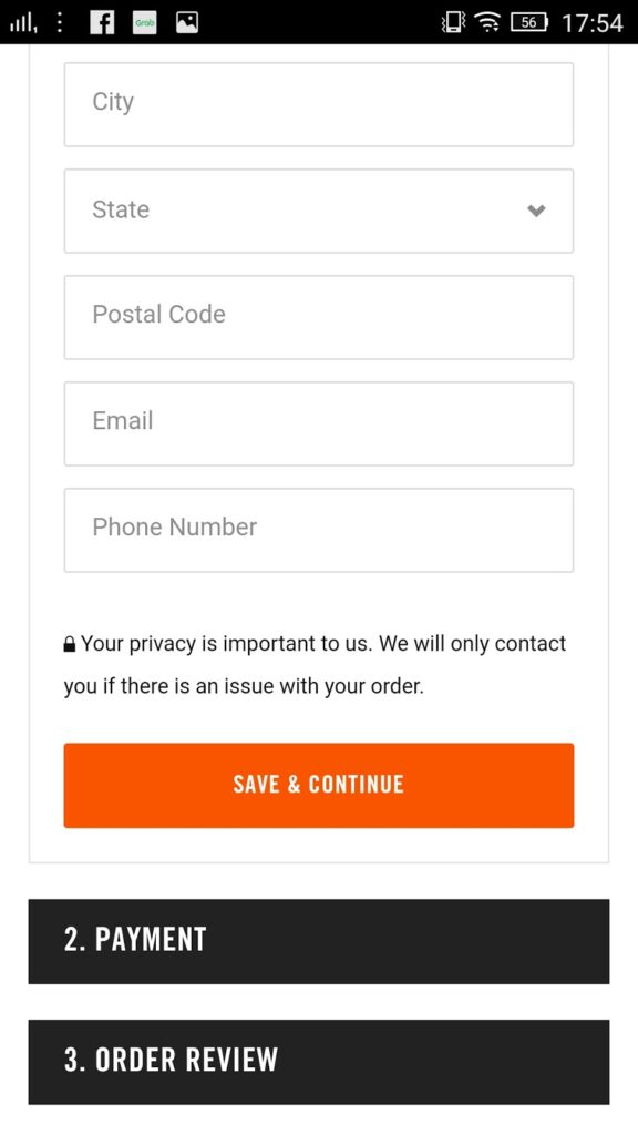
I decided to checkout as a guest, which brings me to this page:
(Source: Nike.com)
This page is where you put all the details in, broken up into three sections. The shopper can easily enter the required information and see the whole process on one mobile page.
Takeaways: With more than half of online retail revenues in the United States being generated by e-commerce by 2021, it’s critical for your site to be mobile friendly. Plenty of stores are embracing this new era, and if you don’t, you risk being left behind. The key is in design. Ensure the user interface is easy to use for shoppers, from the browsing pages right through to the checkout.
M-commerce is no longer the future. It’s happening now.
Improving Customer Service
A common misconception is that there’s not much you can do in terms of customer service in e-commerce. In reality, there’s just as much need for this as there is in physical stores.
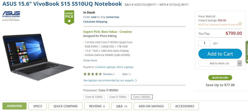
Visitors to your site will still want to access as much information as they can before making a purchase. As we pointed out earlier, 80% of customers conduct some form of research online. As an e-commerce store, you can tap into this by providing all the information they need on your site:
(Source: Bhphotovideo.com)
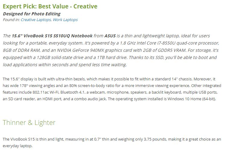
New York-based B&H Photo is an excellent case study of a store sharing expertise and knowledge with its customers. Every product page is like the example above, full of specific details, how best to use the product, and complete with ratings and reviews.
As you can see along the bottom of the screenshot, you have a number of tabs for even more information:
(Source: Bhphotovideo.com)
This level of knowledge and advice will put the customer at ease with the brand. Having that extra layer of confidence would give another reason for them to complete their purchases.
There are other factors too, that we have already briefly discussed. Letting your customers know about free shipping and returns is a good way to entice them to complete the order. Having a smooth running site and giving them different payment options will also minimize abandoned carts. This can all be considered as good customer service.
Takeaways: Essentially, you need to give reasons for visitors to your site to trust you and your brand. B&H Photo’s level of knowledge and expertise is exceptional but it’s a model you should aspire to. Give your customers as little reason as possible to go anywhere else for information. Don’t forget the detail either.
Free delivery, returns, and helplines are all good practice for e-commerce stores. Letting your customers know you have all of these features will help build their confidence in you, and buy from your business.
Conclusion
You will never completely eliminate cart abandonment. It’s a part and parcel of e-commerce businesses. The truth is, the $4.6 trillion is unlikely to go down any time soon, and it will very likely rise even further. The important figure to remember here is $2.75 trillion.
That’s how much is recoverable according to leading studies. The equivalent to the entire fifth largest economy in the world can be recovered, each year.
In order to win those abandoned carts back, you need to understand the reasons why they are being left behind. Though we have listed the top four causes, it’s worth doing your own research and surveys.
However, throughout the post, five main themes became clear:
- Sell your service: This applies to both email marketing and the website. Your customers may already be willing to buy a product, but you should give them a reason to buy with you. The cart recovery emails should point out the benefits and be friendly in tone. The site needs to be well-designed and easily navigable.
- Provide free shipping: If you can afford to, you should provide this as standard. For smaller businesses with smaller margins, consider offering free delivery after a minimum order value has been met.
- Share knowledge and expertise: Shoppers tend to buy when they are more confident. Build their confidence by sharing advice and tips on choosing the right product and how best to use it.
- Be transparent: If there are extra costs such as shipping or tax, let the shopper know as soon as possible. This avoids any last minute abandonment when they are surprised at the overall total. If they understand these extra costs at an earlier stage, then they are more likely to accept them.
- M-Commerce is here now: The reality is people not only shop but also read emails on mobile. By 2021, the majority of e-commerce purchases will be made through such devices. If your site and email strategy aren’t mobile-friendly, your business is already being left behind.
- Cart recovery emails work: Given the fact abandoned carts are inevitable, there’s no doubt email marketing should be a part of your recovery strategy. It gives your business a second chance to boost your revenue.
The issue of cart abandonment calls for an integrated approach. By being proactive, and following this guide, you can turn lost income into a revenue-generating opportunity.
Use your site to build confidence in your visitors, and make them feel comfortable about buying products through your business. Prioritize navigation and a simple checkout process. Ensure they have all the information they need.
Email marketing comes in for those who will inevitably leave their cart behind, no matter what you do. Remind them about their products, offer assistance and engage with your subscribers. If they are not coming back after one or two emails, then play that trump card of discounts and special offers.
Abandoned carts are an opportunity for your e-commerce store. Make the most of it.
