E-commerce is an industry with rapid growth. Total sales are expected to reach $36 trillion a year globally by 2026, up from $4.5 trillion in 2021. This represents a mind-boggling 800% growth in just five years.
Yet the proportion of US e-commerce sales in the retail sector stood at just 15.9% in March 2024.
This underlines the huge growth potential for e-commerce. Driven by giants like Amazon and eBay, sales have rocketed in the last decade, but the boom is by no means over.
There is still ample room for growth.
We have put together some of the best e-commerce sites and discuss what you can learn from them.
Amazon – Undisputed King of E-commerce
(Source: Amazon.com)
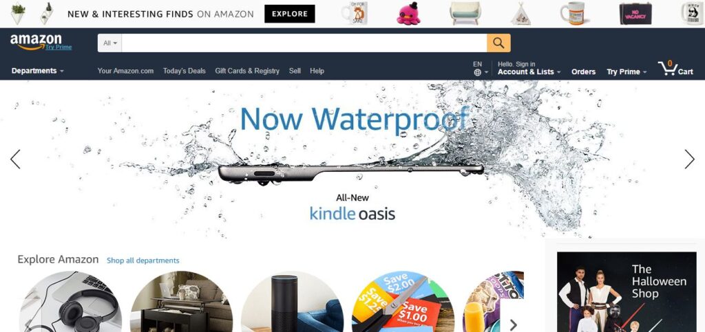
Accounting for an eye-watering 40.4% of US e-commerce sales in 2024, there is no denying it: Amazon is the king of e-commerce, making $574 billion in revenue last year alone.
One of the key elements of Amazon’s success is its unerring focus on customer service. The e-commerce giant has addressed a frequent complaint by providing free and fast shipping to Prime members.
The fact that 2-day shipping is now considered the norm in e-commerce is largely because of Amazon.
It’s all part of Amazon chief Jeff Bezos’s determined pursuit of a “customer-focused culture”.
Another aspect of Amazon’s customer focus is personalization. From the “Hello Erik” message whenever I visit the site to the recommended products based on my browsing history, it oozes the personal touch.
The ability to personalize the homepage leads customers to the products they have demonstrated an interest in. According to McKinsey & Company, recommendation algorithms drive 35% of all sales on Amazon.
B&H Photo Video – Smooth and Efficient Checkout Process
(Source: Bhphotovideo.com)
B&H Photo Video comes up as number one in the Baynard Institute’s Top 50 E-commerce Checkouts rankings. With an average 69.23% of customers abandoning their carts, it’s worth looking at the steps the specialist store takes to reduce the rate.
One of the key elements behind the B&H brand is its high level of knowledge. This is evident throughout the purchasing process.
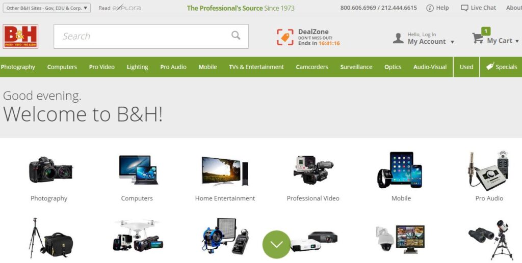
After selecting photography on the homepage, I’m taken to a sub-category which offers a full breakdown of options.
The stand-out feature here is the section asking customers what they would like to shoot. This adds a layer of reassurance to photographers looking to start out or looking to build their knowledge.
After clicking on the night tab, I’m presented with a number of resources I can use to find out more.
The level of customer support at this stage ensures potential buyers have the confidence to pick the right product. This decreases the chance of them abandoning their cart.
Moving into the checkout process itself, the customer service ethos continues. With a simple “Add to Cart” tab next to each product, B&H make it easy to shop for items.
Once you have added an item to the cart, a helpful confirmation popup appears with supplementary products.
This presents the opportunity for the brand to upsell and generate more revenue for the business.
The next step is to pay for the items. When you are ready to proceed to the payment portal, B&H calculate the total cost including shipping and taxes.
The transparency is important. The Baynard survey shows 61% of abandoned carts were due to extra costs including shipping, once those “just browsing” are segmented out.
B&H addresses another common cause of abandoned carts by offering a simple checkout without having to sign up for an account.
Having to sign up to accounts puts off 31% of customers who have abandoned their carts. Offering a variety of options, including the quick social media login can help boost the completion rate.
The final stage is the shipping and payment details. The process is easily navigable for any customer to follow. It is also notable that the cart with the full details is clearly visible at each stage.
B&H may not be the biggest brand in the world but they have nailed online customer service. There is much to learn from the smartly designed website, excellent knowledge, and its efficient checkout process.
Frederique-Constant Smartwatch – Highlighting the Product

(Source: frederiqueconstant.com)
This impressive site was built especially for Frederique Constant’s Horological Smartwatch. Landing on the homepage, you are immediately presented with the watch and its key benefits.
The white background ensures there is no distraction from the watch. The focus is exclusively on two components:
- Images of the watches
- The features of the watches
With the brain processing images 60,000 times faster than words, there is no denying the power of good product pictures. Frederique Constant utilize imagery to show its high quality watches and the craftsmanship behind it.
As well as being visually appealing to website visitors, optimized images can boost the SEO of the site.
High quality website design, clear images, and good SEO practice is a winning combination.
Sears – Mobile Friendly Design

(Source: Sears.com)
American retailer, Sears, takes fourth spot on the Baynard top 50 e-commerce sites for mobile usability. The comfortable user experience of its site earned the brand top marks.
The key is to avoid small links or call to action (CTA) tabs.
Sears uses distinguishable blocks for each product and option on its page. This enables to user to easily click through to the page they want to see. With clever design and selective use of content, customers get all the information they need in each block.
The menu is also designed with the mobile user in mind.
Each option is big enough to a thumb to tap into. The text is legible and there are no distractions. The mobile site has minimal content so the important and necessary features take prominence.
A survey from Smart Insights suggests that average e-commerce mobile conversion rates stood at 1.55% by the end of 2026. Measured against desktop conversions of 4.14% over the same time period, it is clear e-commerce has some way to go in creating mobile friendly sites.
In 2024 mobile overtook desktop as the leading source of e-commerce traffic. Thereby presenting an important challenge for retailers to address.
Etsy – Unique Products
(Source: Etsy.com)
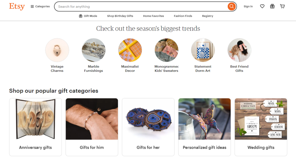
E-commerce platform Etsy’s mission is to connect creative entrepreneurs with buyers. With a clean and minimalist homepage, the website does just that.
The three unique selling points (USPs) for buyers are featured prominently on the page:
- Unique products
- Independent sellers
- Secure shopping
Reinforcing the idea you can find products that you can’t get anywhere else is a powerful way to prevent visitors browsing other sites. This shows in the sheer variety of options on the homepage.
Buyers can see the average customer ratings on the most popular products, which is a surefire way of boosting site conversion rates. And Etsy goes one step further when I keep scrolling down:
By using customer reviews, Etsy is tapping into one of the most influential tactics in marketing. A Kissmetrics study showed that 55% of shoppers are influenced by online reviews.
The purpose of the site is to make visitors feel comfortable with using the platform to buy unique products from independent sellers.
Walmart – Using Special Offers
(Source: Walmart.com)
Given the media focus on the extraordinary growth of Amazon, it’s perhaps surprising that Walmart’s revenues in 2016 stood at $485 billion. Three and a half times bigger than the e-commerce giant.
However, Amazon is way ahead in the e-commerce game, leaving the brick and mortar brand in its wake.
In recent years, Walmart has shifted its focus to the online business as demonstrated by the $3 billion acquisition of Jet.com.
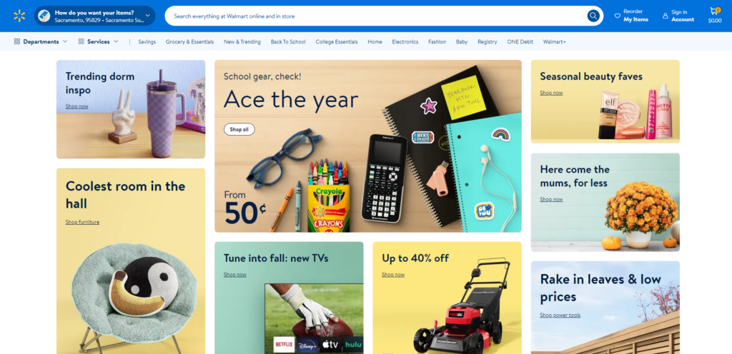
Looking at the site itself, it is notable Walmart is keen to promote special deals. It does this because it works.
According to Accenture, 59% of US customers want to see real time promotions and offers. This is backed up by the fact 94% of shoppers invest time in finding the lowest price for products.
Walmart relentlessly drives home the message that it has the best possible deals on the market.
Though too much promotion and special offers can affect the margins of a business, the strategy seems to be paying off for Walmart. In Q2 this year, the retailer reported 60% year-on-year growth on its online store.
Conclusion
The six e-commerce sites all offer invaluable lessons in how to grow the revenue of your business. Each site takes proactive measures to drive customers to the products and makes it as easy as possible for them to purchase.
Here’s a review of what you can learn from the top e-commerce stores:
Personalization
Though Amazon has mastered the art of personalization, most e-commerce businesses now use it in some form. One of the best examples of this is using shoppers’ purchasing history to recommend products to them. Such methods drive up to 35% of all sales on Amazon alone.
Look at Abandoned Carts
With a whopping $4.6 trillion being left on the table through abandoned carts in 2016, it is logical that e-commerce stores look for ways to reduce the abandonment rate. The top sites take a holistic approach to solving the issue. B&H Photo Video scores highly with a transparent and simple checkout process combined with excellent customer service.
Even the best websites can’t reduce abandoned carts on their own. Products such as MageMail, provide automated email solutions for businesses. This includes trigger emails after a customer left their cart.
Mobile Friendly
A majority of visits to e-commerce stores are from mobile devices. Yet, most purchases are made on desktop computers or in-store. To capture those smartphone and tablet users, you need to create mobile friendly websites. The key to its success, as we have seen from Sears, is in the design.
Images
Let customers see your products in the best possible light. Frederique Constant use the power of imagery to promote its watches. The saying; “A picture is worth a thousand words” rings true here. There is also the added bonus of using optimized images to boost your site’s SEO.
Unique Selling Points
The exact number of e-commerce sites is up for debate. What is beyond dispute is the fact there are millions of online stores around the world. So, you will need to outline the reasons why customers should store using USPs. Etsy do this on its homepage to great effect.
Special Offers
Who doesn’t love a good deal? Walmart aggressively pursues the strategy of offering promotions to customers, which has paid off for the brand. However, it’s not an approach all e-commerce businesses can afford to take. Before considering special promotions, consider your margins.
Customer Service
Never underestimate the value of, or delivering, excellent customer service. There is a reason for Jeff Bezos’s unrelenting focus on it.
All of the top six sites offer good customer service in their own forms. B&H Photo Video share expert knowledge, Amazon nails personalization, and Etsy use product reviews. Reassuring customers that they are buying from a reputable brand will drive up your revenues.
Free Shipping
Thanks to Amazon, free shipping is now considered the norm. Backed up by the fact 61% of abandoned carts are due to extra charges including delivery, most of the top stores now offer free shipping packages. If you are a small company with limited resources, consider offering free delivery after a minimum value of orders.
The future for e-commerce is bright. With double digit growth expected in the next few years, the multi-trillion dollar industry continues to evolve. New ideas and strategies will come about, but for now learning from the top online stores will put your business in a good place to take advantage.
