Your triggered emails, like your promotional emails and newsletters, should reflect the core aesthetic of your business if you want to increase brand presence and engagement. But they also need to be readable.
So what’s the best font for email?
Colin Wheildon, author of Type & Layout: Are You Communicating or Just Making Pretty Shapes? writes — “it’s possible to blow away three-quarters of your readers simply by choosing the wrong type.” If you spend time crafting the words you use, you should care equally about how you present them to your audience.
The fonts you have in your business emails, used right, are recognizable symbols for you to spread around the digital world, echoing your brand’s unique style. If text is the equivalent of the spoken word, the typefaces you use are your voice. They influence your tone and can create familiarity with your customers.
We know what you’re thinking…
“I’m a creative. With the fonts I know and love, I can create emails that not only stand out but are readable, fresh, and timeless.”
You may even have considered branding your MageMail emails with fonts to match your site.
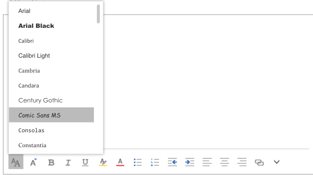
But as you start to format your email fonts you’ll notice something: those reams of typefaces you used to design your site are nowhere to be found in your email dashboard. All you’ll find are “web safe” fonts such as Times New Roman and Arial.
So how do you make your written content appear visually distinct to strengthen your brand presence and impact? Are you stuck with using Comic Sans for every marketing email you send?

Fonts screenshot
In our Ultimate Guide to Email Typography, we introduce you to the best fonts for email you need to be using for any body copy and display text, show you how to shoehorn in any typeface you like, and tell you what font sizes and settings to use.
Read on!
Cross-Platform Fonts
“Why can’t you just use any font you want?” you might ask.
In a contemporary world with virtual reality (VR) and artificial intelligence (AI), how can we not have an email network that is fully compatible with the fonts available to us with other web-based media?
The thing is — you don’t send fonts yourself, you use other peoples’. It is not just you that needs to have the font available, e.g. in MageMail, or another email service provider.
Your recipients’ email client displays the text you send in the intended font style, only if the font style is compatible on their end.
If you are sending marketing emails, order confirmation emails, or anything else, your live text fonts need to be compatible with all your recipients’ email clients and computers. You want to reach as many people as possible for the best chances of the most promising leads. This means you need to use cross-platform fonts for your live text, which work with the majority of email clients and services.
Here’s the full list of the fonts supported by most email providers:
Arial, Arial Black, Comic Sans, Courier New, Georgia, Impact, Charcoal, Lucida Console, Lucida Sans Unicode, Lucida Grande, Palatino Linotype, Helvetica, Book Antiqua, Palatino, Tahoma, Geneva, Times, Times New Roman, Trebuchet MS, Verdana, Monaco.
As you can see, there’s not a huge selection. Many of these “web safe fonts” are also unsuitable for your email copy because they lack clarity. You want your emails to look great. But you also want them to get read.
Take Helvetica as an example. It makes a bold impact when you use it in a title or headline. But displaying your body copy in Helvetica can make it difficult to read. As one type designer explained to Bloomberg, “the letters are too close together.” This makes it too hard to scan the shapes and quickly digest information. With the average time spent on an email being around 11 seconds, it is crucial for your content to be readable.
In a different vein, “fantasy” or “novel” fonts, such as Comic Sans, can undermine your core brand aesthetic because they appear cheap and amateurish. For the main body copy in your emails, you need compatible typefaces that are readable yet neutral. You don’t want to draw attention away from any display text that might also be included like: your offers, your headings and headers, and the words on your buttons.
So which cross-platform fonts make your emails and live HTML text most readable for recipients, without taking away from the core aesthetic of your brand?
Here are our 5 best fonts for email to use for optimum readability and neutrality:
1. Georgia

Georgia is a serif font (which means it has little curls or balls at the end of its letters). Designed in 1993 for Microsoft, it was inspired by the early Scotch-Roman typefaces used in print. It has an authoritative, “classic” aesthetic after its established use in novels and newspapers. This is one of the easiest fonts to read, with even letter spacing and heavy serifs that serve as a guide for the eyes as you move them across the page.
2. Verdana

The Verdana font, named after its designer’s daughter, is literally a combination of the two words “verdant” (something green) and “Ana” (her name). It is one of the most easily readable, sans-serif, web safe fonts. Similar-shaped letters are designed to appear differently, specifically for increased overall legibility. Lowercase letters are taller than is typical of a font of this type, so it can be a great font to ensure your sentence-case copy is accessible to all ages and abilities.
3. Times New Roman

Times New Roman was commissioned by British newspaper The Times in 1931. A heavy serif design, and contrasting line weights (for example, how the short line at the bottom of the “T” is much thinner than the vertical line that leads down to it) help guide the reader’s gaze from one letter to the next. It is familiarity that makes Times New Roman so popular though — until 2007 it was the default font for every version of Microsoft Office and many other word processors. Use it for a serious, classic, and reputable tone in keeping with its usual use for official documents.
4. Trebuchet MS

When Vincent Connare designed this sans-serif font he named it “Trebuchet” — literally, a medieval catapult. He thought it would be “a great name for a font that launches words across the Internet.” And he wasn’t wrong. Trebuchet is now one of the most established, web safe fonts. It is designed with clean little flicks at the beginnings and ends of difficult letters which serve as legibility guides, while not distracting too much from the main shapes of the letters, as with complete serifs.
5. Arial

Arial was designed in 1982 to serve as a free alternative to the already-popular Helvetica. Arial is the source of much debate when it comes to web and email copy. Though many software manufacturers and email providers use it by default, some designers claim it is difficult to read, with letters placed too close together, as with Helvetica. Similar letters appear to have the same angles and lines, making it difficult to distinguish between them in large pieces of text. Nonetheless, many designers appreciate Arial as a great font to compliment a non-invasive, modest, and recognizable tone from its somewhat ubiquitous use as a software default.
Whatever web safe fonts you use, be aware of their effects. Cross-compatible typefaces are so established they are taken for granted more than most. They can sink into the page and become almost unnoticeable. This means readers can focus more on your content than how you present it, which is especially necessary with lengthier copy.
Size Matters
After working hard to select the best fonts, it would be a tragedy for your text to appear too little or too large to read. But it can be difficult to tell how live HTML text sizes will appear for different recipients. Here’s a handy guide to the font sizes and line height to use for the most readable cross-platform text.
Header: 22 – 28 pixels
Body Text: 14 – 18 pixels
Line Height: 1.4 – 1.5
The sizing of your text will vary depending on the font you use, so play around with values within these proposed ranges and see what works best for you. Always send yourself test versions of your emails to check the variations and consistencies are as intended. Check, check, and check again to make sure your text is clear on all devices and for all email clients.
Web Fonts
To stand out as a unique brand, you need to draw your recipients’ attention to the core elements of your emails that your body copy is intended to support. This is the point at which you may want to explore other typeface options and tactics. You may have heard of “web fonts.”
Web Fonts, not to be confused with Web Safe Fonts, are becoming more prevalent. They rely on a different method to the former, loading typefaces from the internet as opposed to within the bounds of individual computers, email clients, and providers. The most popular email services, including Gmail and Outlook, have no problem displaying them.
This is great if you know what email providers your recipients use. Unfortunately, lesser-known email services, as well as those designed specifically for business, may not display your web fonts. Instead, they will switch to a default font, or if you have specified a compatible “backup” font, this is what your recipient will see.
Different fonts exhibit variations in size. This means that if your text is displayed in a font that you never intended it to be, your emails could appear untidy and unprofessional to recipients with incompatible email clients. It’s not the end of the world, but if you are going to the effort of designing your emails well, you want them to reach as many people as possible in the form you intended.
For high-volume marketing emails, web fonts are not yet ideal then, as they are not as widely established.
Brand Fonts
The typefaces you use are a huge part of your identity as a brand. You need to show subscribers your style weaves seamlessly through everything you do to create a recognizable aesthetic and a familiar connection every time they open up your emails. Keeping fonts consistent for elements such as your company name, headings, and offer text is vital if you want to establish yourself as a company with a personality — a brand and not “a business.”
Though web safe fonts can be good for wedges of copy, they give you little to play around with in terms of bold, magnetizing, and unique design. But it’s not just your text-on-the-page that you need to select fonts for. In a business context, your multimedia content is full of written copy, the purpose of which is to entertain, interest, satisfy, and pleasantly surprise. These are the parts of your emails that you want your readers to see first, so you need to use fonts that draw attention to themselves and make a statement.
Images and other visual media, like banners, backgrounds, and buttons (CTAs), can include any of the diverse fonts you have access to within your graphics software. What’s more, visual file formats give you the ability to “lock in” your fonts so they appear the same across multiple devices.
With MageMail it’s easy to add multimedia content to your triggered emails, but you can also follow these techniques to increase the effectiveness of your newsletters and other regular mail.
Here’s how to get brand fonts into your emails by using them for the display text in your multimedia content:
1. Static Images

(Source: reallygoodemails)
Images have become increasingly common in the email format. Though most email providers still block images the first time they are received from a new address, users can easily click to display them if they deem the sender to be safe. The presence of your web safe body copy should always serve as a fallback, regardless, providing all the information your recipient needs in case any images or other multimedia content fail to load.
Web fonts may be distorted if they aren’t compatible with your recipients’ email client, your images will either appear or not. This means that even if your images fail to be displayed, your subscribers will still be aware of what the information is. They won’t just assume your company is incompetent at designing readable emails. This makes them preferable to web fonts, which, as noted above, can vary in appearance, making you seem unprofessional.
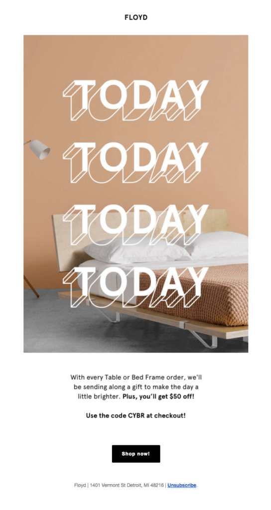
In the example above, furniture store Floyd overlays their promotional image with a bold, chunky, font. The name of the company (its logo) is too displayed as an image file above, even though it contains only text. The offer text typeface is geometric, 3D, and more complex in terms of design than any of the web safe fonts. The company name font is minimal, yet tall and sharp. The fonts combine to create an aesthetic of clean lines and sharp angles, reflecting the company’s precision engineering and design. No doubt, these short pieces of copy would have a lesser impact if they were displayed in a standard, cross-compatible font.
2. Animated GIFS

(Source: reallygoodemails)
GIFs add motion to the static email format in a very instantaneous manner. Whereas videos can take long to load and require your recipient to actively press play, GIFs are displayed almost as soon as you open an email in their animated form (with compatible email clients).
GIFs are surprisingly well supported across most email clients, with the only downside being that unsupported email clients will only show an initial frame. This can easily be combatted by ensuring all key information is displayed in the first frame. You can also use whatever fonts you like in a GIF, as they are essentially just flip-books composed of images.
Adding movement to text can give it some life. Play with some color changes to make your headline appear to flash, or perhaps add some subtle, sporadic movements to each of your letters to separate them from your static background. If you want to create your own GIFs, take a look at Adobe Creative Cloud which guides you through designing them in Photoshop. You can also use sites such as giphy.com to make your GIFs quickly and then overlay text with custom fonts using your graphics program.
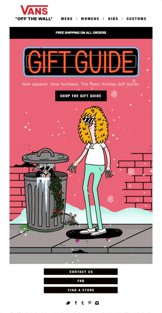
The Vans holiday gift guide email (above) uses a custom, animated font for its “GIFT GUIDE.” Skeuomorphic design (making digital elements resemble their real-world counterparts) is used to make the typeface reminiscent of neon sign-writing, with a flashing, glowing effect. The font fits in with a holistic, cartoon-style aesthetic, with its equally weighted lines and curved angles. The animated movement does an amazing job of gravitating your gaze toward it as well as reflecting a brand identity that screams “creativity” and “innovation.”
3. Add a Custom Call-To-Action

(Source: reallygoodemails)
With MageMail triggered emails, all images are linkable. This means you can design your own custom CTAs with typefaces to match your unique brand voice and style. Create the button you want to use as an image in your graphics editor, insert it, and make sure you link it to a landing page on your site.
Your CTAs need to be clearly visible, as they represent the path you want your users to take through to your site (and hopefully to a purchase). Marketers observe significant differences in click-through rates from slight adjustments to their CTA buttons. Simply changing the text from “Start my 30-day free trial” to “See demo” could improve click-through rates by 211%. Making your CTA as attractive as possible could make a huge difference to your email revenue.
For a brand like Starbucks, in an extremely competitive market, it is important to display a consistent brand presence as well as attract users with an eye-catching CTA. If everything you do reflects your unique aesthetic, you will better communicate the type of brand you are to subscribers. Consistent branding also shows high design standards, an important perception to create if you are selling any “luxury” consumer products.
The “Join Now” button in the Starbucks email campaign above takes advantage of the same brand font used to display their company name. This familiar, “all-caps” font style draws attention to itself, contrasting with the body of the message, presented in sentence case, with a neutral font. The font not only makes the button visible but helps strengthen the presence and influence of the infamous Starbucks brand through familiarity with this established brand font.
So what are the best fonts you can use if you want to spice up your multimedia content? Here are our top 5 contemporary fonts for use for your multimedia copy:
1. Open Sans
Open Sans
Open Sans is a sans-serif font designed specifically with digital content in mind. Commissioned by Google in 2010, it has “upright stress, open forms and a neutral, yet friendly appearance.” It has been “optimized for legibility across print, web, and mobile interfaces.” Open sans is now one of the most popular alternatives to the standard web-safe fonts, often used for large chunks of text but also fit for clear, friendly, conversational headings, titles, and offers for its minimal simplicity.
2. Josefin Slab
Josefin Slab
Josefin Slab is an eye-catching, quirky, yet minimal serif font style. It is a mix of Scandinavian, geometric aesthetics and modern detailing. Lightweight lines give it a fresh, airy feel, though its quirky attributes (such as the upward stress on letters like “e” and “f”) can make it difficult to read in large blocks. Use it to grab your reader’s attention or re-brand your company name with a sleek, modernist aesthetic.
3. Arvo
Arvo
A bold, serif font like Arvo makes a statement. With heavy serifs, which act like grounding feet, the letters stand strong and independent, with little fluidity from one to the next. This is a relatively new font, used a lot in web design. But beware. It is bold, brash and should be used for display text and headings as it can be hard to read when used in long sentences.
4. Lato
Lato
Lato, meaning “summer” in Polish, is a popular font for lengthier display copy such as complex offers and descriptions. It’s ease of readability and simple, rounded shapes also suit it to friendly, unassuming CTAs and modest, colloquial headings. If you have to use more than a couple of words to get your information across, Lato’s compact form also means you will be able to fit more in while maintaining a high level of clarity. This is good to know, especially if your CTA text is more complex than the standard two-word “Buy Now” or “Join Now” versions.
5. Vollkorn
Vollkorn
Vollkorn is an open-source, serif typeface designed by Friedrich Althausen in 2006. Vollkorn was designed primarily for body copy but stands out in its heavier weightings, where it works well for display text in headers and headings. Its serifs help anchor the readers’ eyes to the page and give a classic, reputable, “old world” quality similar to Times New Roman. Use it for a contemporary take on this authoritative, print-influenced tone.
Use extraordinary typefaces to create a lasting impression with your display text. Overlay your images, GIFs, and CTA buttons with fonts that pull your subscribers into your promotions, content, and your brand community.
Limitations Breed Creativity
Revolutionary composer Igor Stravinsky said, “the more constraints one imposes, the more one frees one’s self… the arbitrariness of the constraint serves only to obtain precision of execution.”
The limited range of fonts you can display in the main body of your emails should not be considered a limitation at all, but an opportunity for creativity. Just as with web design, everybody else is subject to the same requirements and standards.
Knowing the best fonts for email and the font sizes to use will make your business stand out against competitors. Using the techniques we have provided, you can design emails with fonts that reflect your company’s unique style, while being readable, clear, eye-catching and unique.
Get creative!

