Newsletters are a staple of email marketing. Yet many businesses do not use them to their full potential.
For a well-managed email marketing strategy, open rates could be sky high. However, if the content becomes repetitive and dull, customers start to ignore your emails, or even worse, unsubscribe.
Across multiple industries, average open rates stand at around 36%, which shows email marketing works.
So what do you need to do to make your email newsletter stand out? With 81% of B2B marketers using email newsletters for content marketing, it’s an important challenge.
- Segmentation: We have said this time and time again. The key to a successful email campaign is segmenting your list and targeting the right audience. Moreover, segmentation is evolving, and it’s increasingly focused on the individual. Doing this right will enable you to send personalized newsletters.
- Branding: All businesses, large or small, need to develop a consistent brand. Ensure your email has a similar design to your website that is familiar to your subscribers.
- Relevant, high-quality content: We preach about this all the time. The email should contain high-quality, relevant content your subscribers want to read. There is no shortcut here. Ensure the central message is clear to your audience.
- Be smart with images: Images can be a real asset to an email if used correctly. They need to be optimized and reduced to fit in with the template. Failing to do this, will lead to images not loading correctly. Also, consider the number of images in your email.
- Add a clear call-to-action: The purpose of your email is to drive traffic to your site and build revenue. A clear call-to-action (CTA) is crucial for a healthy click-through-rate (CTR).
One of the best ways to learn about email marketing is by looking at real-world examples. So, we have put together a list of 24 killer email newsletters for you split across eight categories:
Personalization
1. Agoda
(Source: Agoda.com)
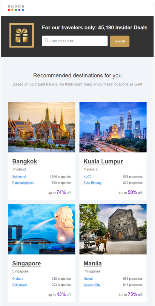
This is a classic example of a brand utilizing personalization to deliver tailored content. Travel company Agoda uses the subscriber’s browser history to put together highly targeted emails. As you can tell, I travel around Southeast Asia a lot, so this email is relevant to me.
The benefits of segmenting email lists are clear. A survey from MailChimp found that segmented campaigns saw a 14.31% increase in open rate and received 100.95% more click-throughs than non-segmented versions.
By using the data from its website, Agoda can send highly targeted emails that get opened and generate revenue.
2. Twitter
(Source: Author’s screenshot)
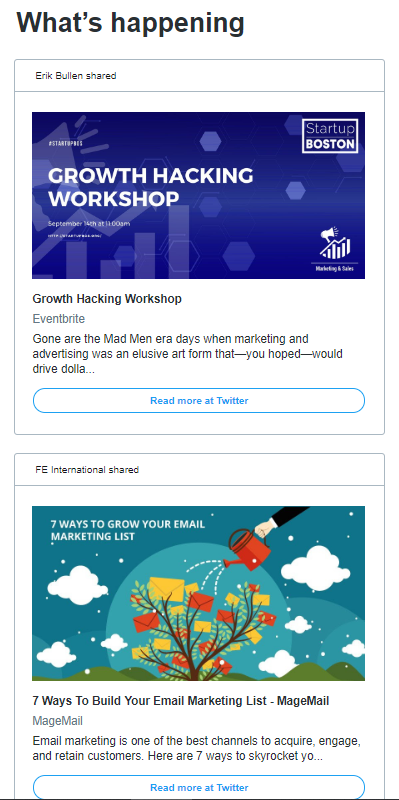
Twitter is another brand which sends highly personalized emails on a regular basis. Like Agoda, it uses browser history to gather the content each subscriber wants to read. As you can see from the example above, Twitter knows I would be interested in posts relating to MageMail, and it duly delivers.
On a wider scale, these daily emails are tailored to the interests of subscribers through the people they follow and view on a routine basis.
3. Carphone Warehouse
(Source: Author’s screenshot)
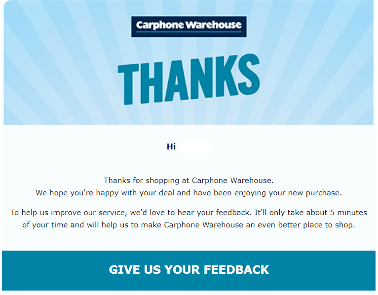
British phone store, Carphone Warehouse, taps into one of the most effective forms of marketing. It asks for customer feedback which brings a number of benefits:
- Engage with your customers: Making your customers feel like their opinions matter is an effective way to retain their business.
- Improve your product or service: There’s no substitute for getting the experience of customers. You can do all the trials and surveys, but it’s almost impossible to replicate real-life situations. Getting detailed feedback will give you invaluable insight.
- Positive feedback as a marketing tool: Studies and surveys suggest reviews influenced up to 68% of purchases in the United States in 2017.
Your business should also consider how to respond to negative reviews. A ReviewTrackers survey found 44.5% of respondents were more likely to visit a local business if they replied to negative reviews.
Deliver Interesting Content
4. Mercedes-Benz
(Source: Mercedes-benz.com)
The key is to tailor personalization to your market.
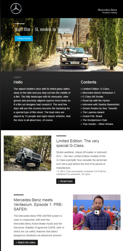
Luxury automotive brand, Mercedes uses the newsletter to share interesting and engaging content. Not only personalizing its emails, the car-maker takes the opportunity to give value to its subscribers.
Mercedes takes a less direct, but no less efficient, approach than Agoda.
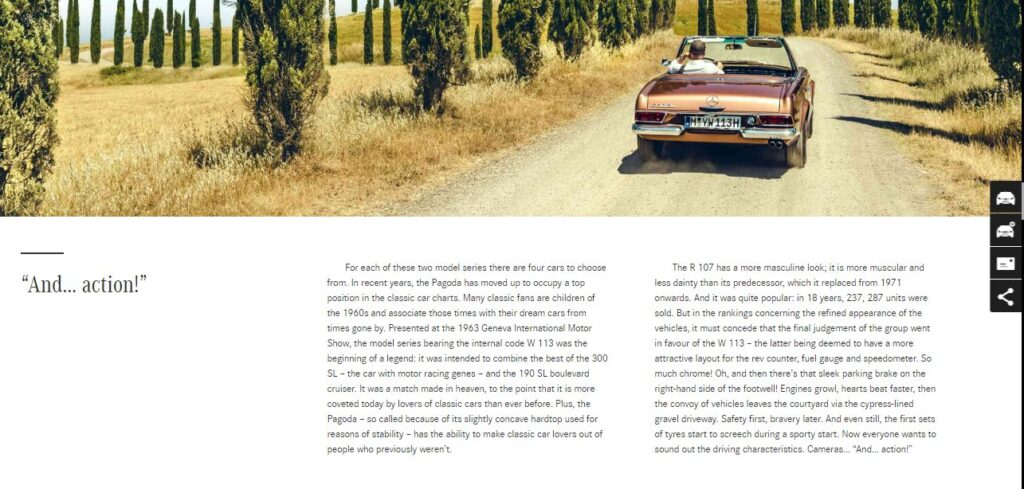
By clicking into the top story within the main image, you are taken into a long-form article about the historic Mercedes SL class:
(Source: Mercedes-benz.com)
Following eight classic SL models, the writer joins the participants on a journey through Tuscany. A perfect synergy of a world-renowned luxury travel destination and a globally recognized car brand. This is exactly the kind of content that builds rapport with your market.
No hard sell, no sale promotion. Simply interesting, stimulating, and relevant content.
It also means your subscribers will keep opening your emails and maintain a high CTR.
5. Business Insider
(Source: Author’s screenshot)
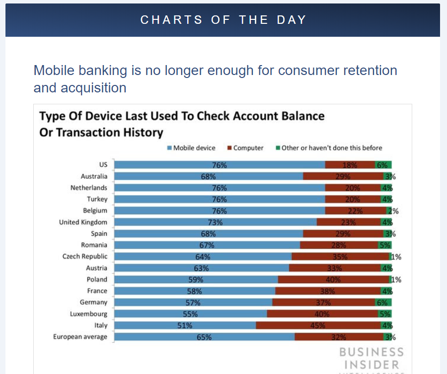
Business Insider creates engaging daily emails for its subscribers. The “Charts of the Day” is one of several features included in the content. Full of information, data, and facts – these emails are perfect for its business-minded readers.
6. HuffPost
(Source: Author’s screenshot)
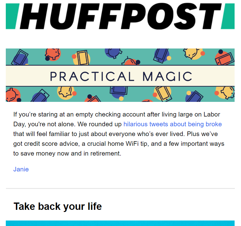
HuffPost segments its emails at the signup process. It gives would-be subscribers several options on the types of content they would like to receive and frequency.
I’ve signed up for the daily “Good Life” newsletter from the online news site. These emails offer practical, useful information as well as injecting a bit of humor. The takeaway here is the fact I receive exactly what I signed up to in the form.
Engaging, interesting, and relevant content on a daily basis.
Use of Images
7. Starbucks

(Source: Starbucks.com)
The priority with images is the same as any type of content. They need to be relevant, look good, and be fully optimized. Starbucks deliver this with aplomb, accompanying pictures with text that state the key messages.
Each image is focused on two things: the brand and coffee. They are enticing and promise useful tips. Much like Mercedes, this email does not emphasize on the selling but building a relationship with subscribers.
When using images, you should follow these practices:
- Reduce the size of images: Most email templates are 800px wide, so reduce your images accordingly. You can also compress files using tools like Tinyjpg.com. Taking these measures will ensure the pictures will load quickly.
- Add alt-text: Some email clients like Gmail and Outlook do not allow images by default. Adding alt-text will let your subscribers know what the images are and that they are safe to load.
8. Etsy
(Source: Author’s screenshot)
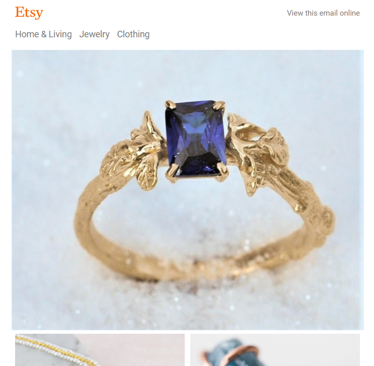
Focused on handmade and unique products, Etsy utilizes large images to draw the attention of its subscribers. The email above ensures the jewelry takes prominence.
Aside from the branding and headings, there’s no need for excessive written content. The subscribers will already be familiar with the brand and understand the purpose of the email from images alone.
(Source: Author’s screenshot)
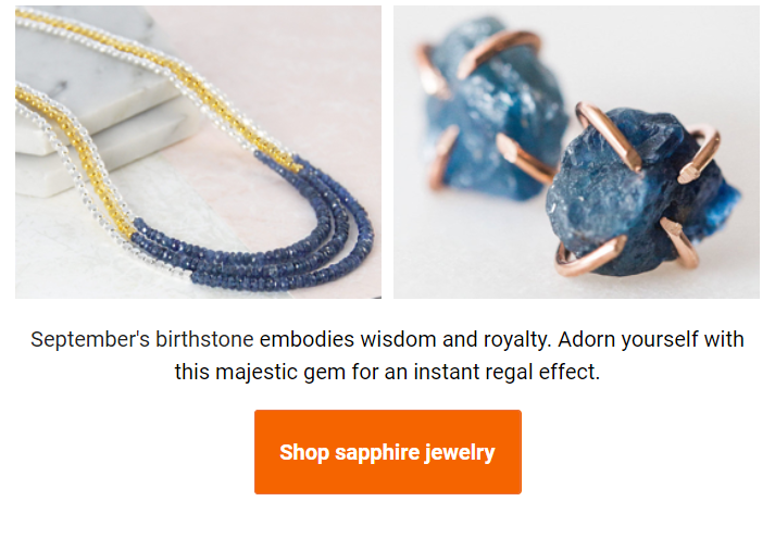
Scroll further down, and the content is fully explained in just two lines. September is the month of sapphire and sets an aspirational tone for potential buyers. The call-to-action tab in a contrasting color completes the effectiveness of this image-led email.
9. Target
(Source: Author’s screenshot)
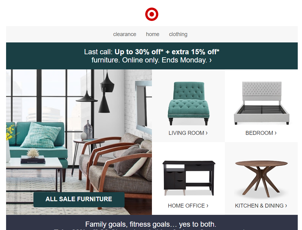
Leading American retailer, Target, designed its email to maximize the number of visible images before the subscriber needs to scroll down.
Using one main image, supported by four smaller ones, the recipients have a clear indication of what this email is about. The retailer delivers focused email targeted at subscribers who may be interested in furniture.
The value of visual emails is illustrated by the fact people form first impressions within 50 milliseconds. In addition, it has been proven that humans process images 60,000 times faster than text – therefore, these kind of emails are crucial if you want to make an instant impact.
Plain Text
10. Hiten Shah
(Source: Hitenism.com)
Depending on your market and audience, images are not a necessity. In fact, some studies suggest plain text emails perform better than HTML, with a 25% higher open rate.
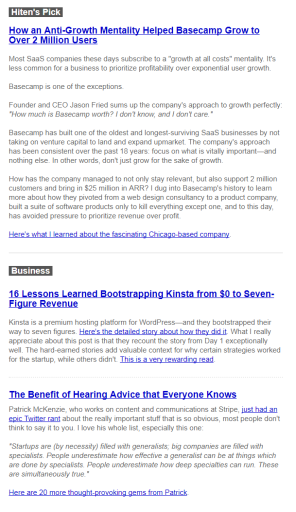
The key to a successful plain text email is the formatting with clear headings and short paragraphs. Leading entrepreneur, Hiten Shah, follows those steps with his “SaaS Weekly” email. Putting together the latest news from across the industry, Hiten follows a simple design.
The hyperlinked headlines are formatted differently from the paragraphs that make up the summary. The reader is in no doubt they can click through to find out more. The summaries are short and concise, making the whole email digestible and easy to read.
11. NextDraft
(Source: Nextdraft.com)
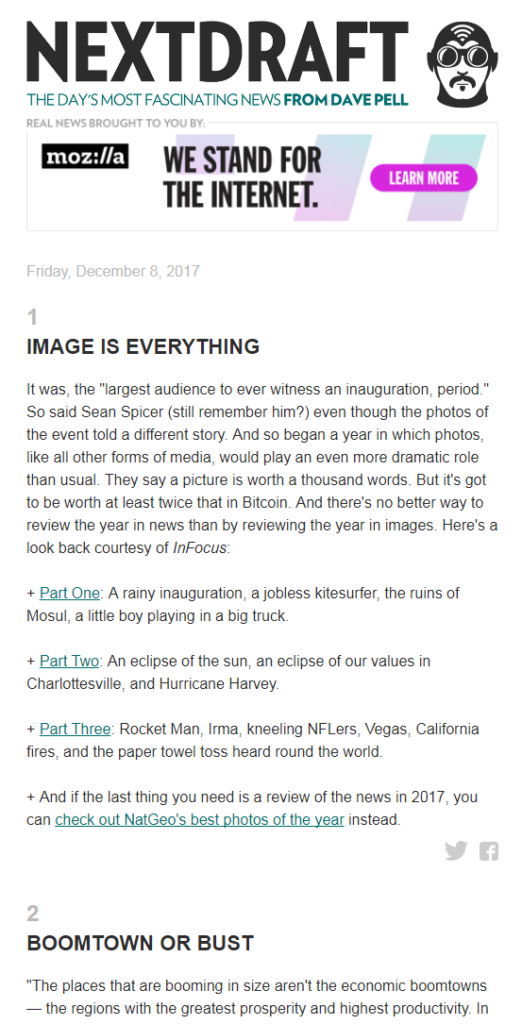
If there was ever an email that epitomizes the value of great content, NextDraft delivers it. This compilation of off-beat, intriguing, and quirky news from Dave Pell has proven to be an enormous success. Due to the quality of the content, Pell does away with the need for images and follows the plain text style.
The design allows the focus to be solely on what makes this email so successful: the content. Dave takes a humorous angle at some of the more serious issues of the day. The writing is engaging and filled with relevant information. With ringing endorsements from The Economist, Forbes, and CNN, it’s the perfect way to catch up with some of the news you would otherwise miss, in one email.
12. Smart Insights
(Source: Author’s screenshot)
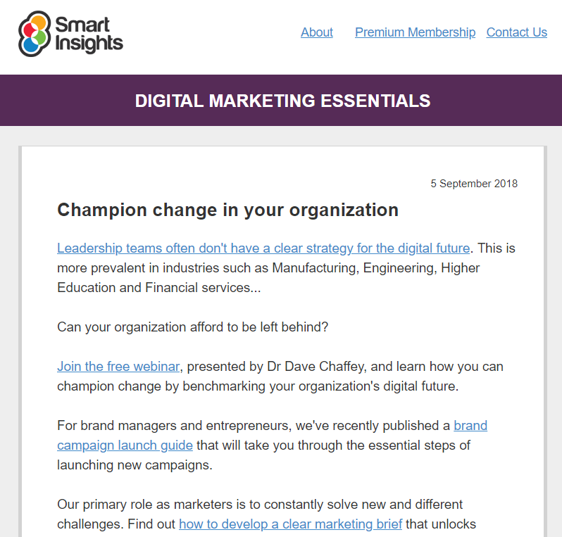
Smart Insights is a company which provides digital marketing advice. As a result, its subscribers are likely to be businesses and marketing professionals who appreciate direct and simple emails, filled with useful information.
The only non-plain-text feature in this email is the hyperlinks to the recommended articles and reports. By embracing this format, Smart Insights is able to deliver the information its audience expect without any distractions.
Concise Design
13. Google
(Source: Google.com)
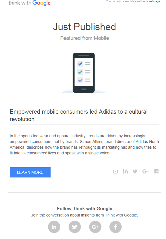
Think with Google uncovers the latest digital marketing trends. Its newsletter template is smart and straightforward with one clear CTA, one main story, and one column. Each of those elements follows the all the necessary rules in email design.
The result is a focused, clear, and coherent message. With readers spending an average of 11.1 seconds on an individual email, the content is easily scannable and perfect for a quick read.
If any company could earn the title as “Master of the Internet,” Google would be it. So it pays to learn from its simplistic style.
14. IndieHackers
(Source: Author’s screenshot)
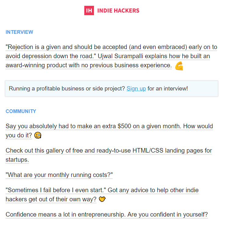
Indie Hackers is an online community of founders and owners who are looking to support each other grow their Internet businesses. The site has forums, podcasts, and plenty of useful content for its audience.
The newsletter follows this example, full of links to engaging interviews and relevant articles. The design allows the reader to seamlessly scan through the email and find the links that pique their interest.
For the specialist, focused subscribers looking for advice and tips, this email fits the bill perfectly.
15. NetFlix
(Source: Author’s screenshot)
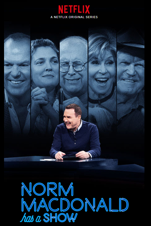
As one of the largest Internet businesses in the world, Netflix has nailed its marketing emails. When it promotes new programs or shows, the media giant uses the image of a scene or main character with the title.
In this case, Netflix takes a shot of Norm MacDonald with a backdrop of celebrity guests on his show. That’s all the subscribers need to see to understand what the email is about. The concise design delivers the message in seconds.
Focus on One Product
16. Apple
(Source: Apple.com)
From one technological giant to another, Apple has long been considered leaders in marketing. So, it’s not surprising when you see killer email design from the world’s most valuable brand.
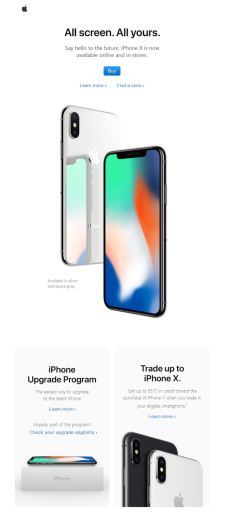
The focus here is on one thing, the iPhone X. The content is short but personal. It generates excitement and sells the idea that the “future” is available now.
Below the main image, there are two options that make it even easier for you to buy the product. It’s a subtle, yet enticing way of promoting a special deal.
17. Chubbies Shorts
(Source: Author’s screenshot)
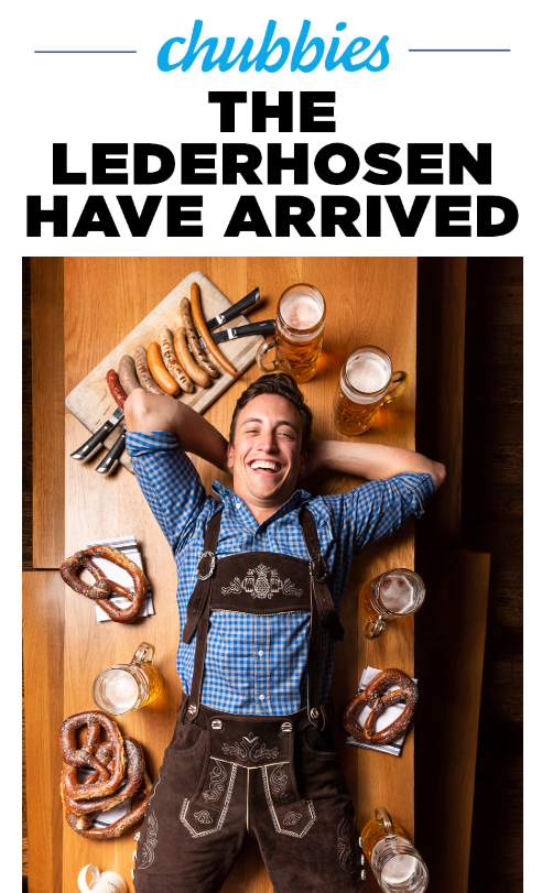
Chubbies Shorts frequently appear in our email marketing posts because it’s so good at it. The American brand sends engaging, humorous, and targeted emails. The latest example takes it to another level.
As part of Chubbies Oktoberfest promotion, the company is selling one-off editions of Lederhosen – celebrated apparel from the Bavaria region of Germany where the festival originated. By promoting just one product, the brand is making the most of the festival which has iconic status among its young and outgoing audience.
It’s a classic example of how to use third-party events for the benefit of your brand.
18. Heathrow Airport
(Source: Author’s screenshot)
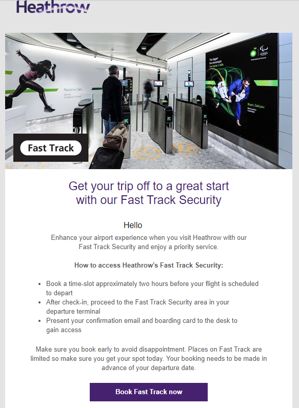
I had a recent flight back to the US from London Heathrow Airport and a couple of days before departure, I received this email. It’s focused on the fast track security service, designed to make my journey smoother.
Heathrow’s email stands out because the tone is all about helping passengers, with the bullet points explaining how it works. The only CTA is the “Book Fast Track now” tab. Direct, focused, and simple. The sole aim is to get subscribers clicking on the CTA and take advantage of a faster passage through security.
Special Offer
19. H&M
(Source: Hm.com)
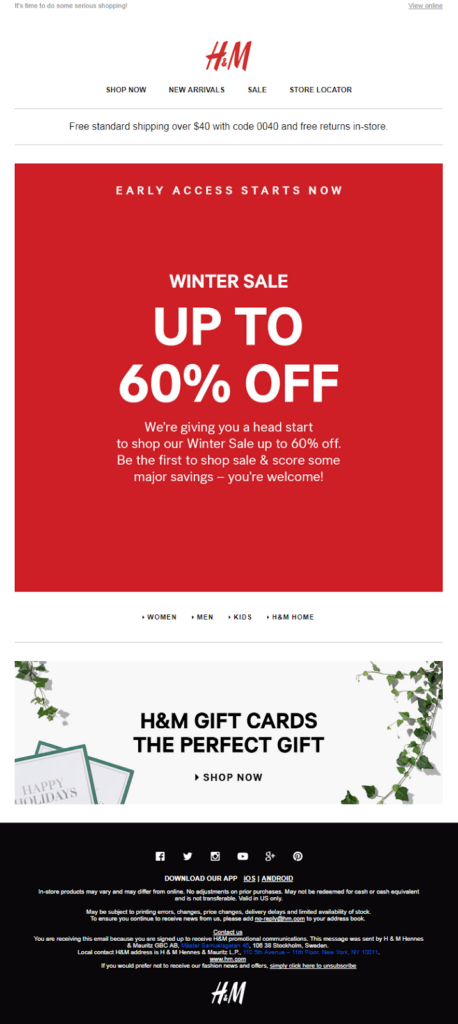
Where Apple and Heathrow are subtle in its approach, apparel brand H&M is more forthright. The big splash of red is unmissable and the head start on the offer is designed to grab the attention of subscribers.
The additional offer of free shipping on orders above $40 is a classic example of encouraging shoppers to spend more.
The singular, direct message works in this case for two reasons:
- Special offer: You don’t need statistics to know customers love special deals.
- Brand: H&M is known for offering apparel at low prices. Therefore, the brand living up to the expectations of its young customer base. An email like this may not be as effective for a high-end, luxury car-maker, for example.
20. PUMA
(Source: Author’s screenshot)
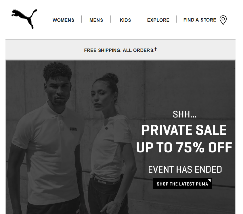
PUMA, one of the leading sports apparel brands, manage to combine a special offer with exclusivity. The idea you’re one of the chosen ones is powerful, and if you have received a private special offer, it can be hard to turn down.
The added touch is I saw this email after the event had finished, and the brand set up the email so it would automatically update itself. By informing me the “event has ended,” it adds a layer of authenticity and urgency for the next round of special offers.
21. Frogger Golf
(Source: Author’s screenshot)
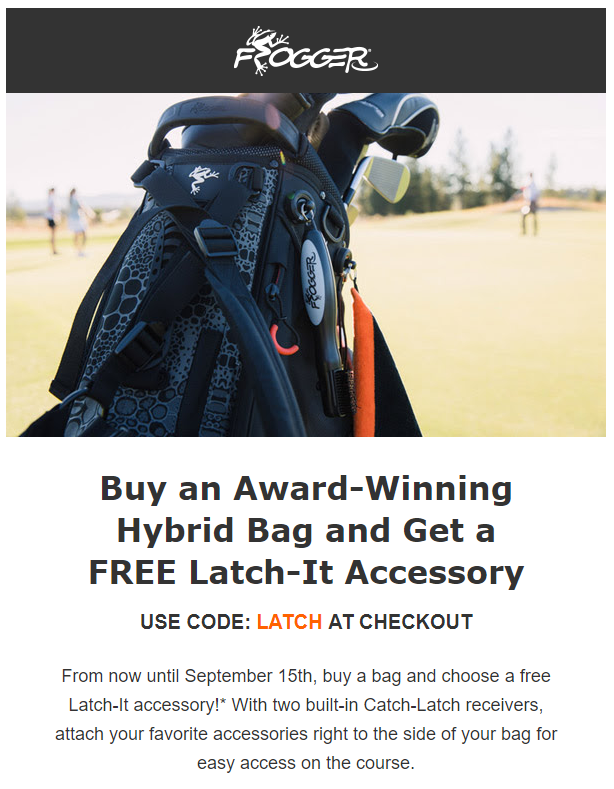
MageMail’s client, Frogger, creates emails with its subscribers in mind. The free products being promoted in this example is not the most exciting to non-golfers, or even golfers. However, they do have value for buyers of the bag.
The accessories are priced up to $25 each and would serve as a worthwhile bonus to the main product.
Anniversary Event
22. Jack Daniel’s
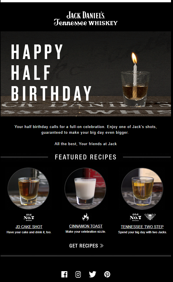
(Source: Jackdaniels.com)
Few beverage brands do marketing as well as Jack Daniel’s. The Tennessee whiskey maker is known all over the world for its heritage and history.
The story of “Jack” is repeated in adverts right across the US and Europe, with the aim of building rapport with customers.
Jack Daniel’s also nail email marketing. Many brands now send birthday emails, usually attaching a special offer with it. So, the Tennessee whiskey maker adds a little twist by sending “half birthday” wishes. Together with some “special recipes” for celebratory drinks, it serves as a pleasant surprise for the subscriber.
It serves another purpose: It helps to develop the relationship between the brand and its loyal customers.
23. Uber

(Source: Author’s screenshot)
Uber may have taken a hit in terms of PR recently, but it still knows how to reach out to its drivers. Not only the brand celebrates the anniversary, it also shares the positive compliments the driver received and just how many journeys they have driven.
Uber takes the time to acknowledge the work each driver has put in and in return, can improve the company’s retention of drivers.
After all, it’s far more cost-effective to retain your staff than it is to hire and train new team members.
24. ASOS
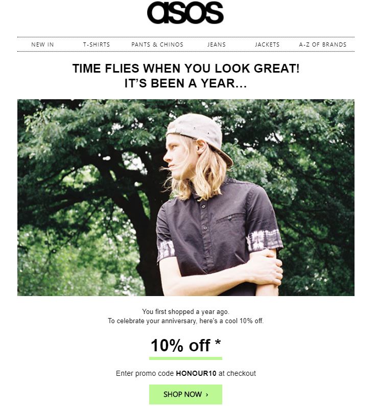
(Source: Author’s screenshot)
Leading fashion retailer ASOS celebrates the one-year anniversary of shoppers making their first purchase by offering 10% off on all its products. Though this is not a huge saving, the email is likely to have been a surprise for subscribers. People rarely remember the first time they bought some clothes or a particular jacket.
The takeaway here is that it doesn’t take much to stand out ahead of your competitors and any special offer should be carefully considered in terms of your bottom line.
Another factor is overloading your subscribers with special deals, and teaching them to wait until the next one to make a purchase. These gestures for anniversaries should be used in moderation.
Conclusion
The number one lesson each of these examples teach you is that personalization works
And it’s getting more personal. Take Jack Daniel’s half birthday wishes, for example, or Agoda’s suggested travel destinations. Both of these were based on individual preferences or events.
Another similarity is a relentless focus on delivering relevant and engaging content. Each brand has a clear purpose in mind when they put their emails together. H&M had a special offer, Hiten Shah delivered the latest industry news, and Mercedes shared stories on its heritage.
The differences come in the type of content the brands used. This is down to understanding your audience and tailoring the emails to reflect their interests.
Take a look at Starbucks, who put together an excellent and useful email for coffee lovers but would you expect the same from Google? While the answer, in this case, is obvious, it underlines a key point. The content of your email needs to be relevant to both your brand and subscribers.
In terms of design, there are a variety of templates on display. The plain text style favored by Hiten Shah and NextDraft is a key part of their success. Whereas Apple uses images to convey its central message. Once again, it’s all down to who your audience is, what they expect, and the best way to for them to digest the content.
In email marketing, the subscriber is king.
