“You only get one chance to make a first impression.” So goes the old cliché. First impressions may not be everything, but they do count for a lot.
An awful lot.
Real world studies conclude you have a seven second window to create an impression, positive or otherwise, when meeting someone for the first time.
That’s not long.
Before people start really getting to know you – your interests, your personality et cetera – they may have already decided whether they like you. Or not.
Not fair, is it?
For better or worse, this same logic applies to emails. The average time spent reading an individual email is just 11 seconds.
Make that challenge an opportunity. Embrace the email design best practices outlined below, no matter how simple or challenging they may seem at first.
Email is likely to be the most frequent communication method you’ll use with customers and leads. Paying attention to detail pays off.
Who Opened My Mail?
We have spoken before about how 33% of recipients decide whether to open an email based on subject line alone. In following email design best practices, we have to look beyond the body text to make a strong first impression, starting from the moment your email hits the inbox.
Here are the elements you need to consider:
- From Name: People like to know who the email is from, so use a familiar name. This could be your brand or the CEO of your company. There is no need to be gimmicky here. Keep it simple.
- Subject Line: One of the trickiest parts of the process lies in writing a subject line that engages the recipient enough to make them open your email. All this within 50 characters, and even less for mobile devices.
- Pre-Headers: Many email providers have the pre-header on as a default setting. This gives you another 100 characters to work with. Your goal is to entice your customers and prospects to open your emails.
Nike has mastered the art of subject lines and pre-headers. “You’re In” is a powerful message, in line with their “Just Do It” slogan.
Nike also managed to get their call-to-action (CTA) previewed in the pre-header with “Thanks for signing up. Next, become a member” making it in just under the character limit (on Gmail at least – more on that shortly.) And, contrary to our advice in previous posts: if you happen to be a sporting goods colossus, you may be able to “just do it” by using Nike in the “from” field, rather than a personal name.
When you think about it, there is plenty of design work to do, even before your email gets opened.
On Message, On Brand
Every element of your email leaves an impression, positive or otherwise, on the recipient. The devil is truly in the details.
One important aspect of brand optimization is your email signature. Often overlooked by small to medium-sized enterprises (SMEs), your signature should act as your e-business card. At a minimum, it should include your company logo, contact details, and position within the company.
Consistency is important. It’s all about demonstrating professionalism and competency.
Ensure that email signatures across the organization share the same design. Often, companies don’t have – or at least don’t enforce – signature standards, resulting in inconsistent brand messaging by employees or departments.
And that doesn’t mean it has to be dull and corporate. If your brand is “young and wild”, you should have a “wild” signature across the board. Just ensure the tone of all communication is consistent with your brand identity.
These considerations should extend to all aspects of your email design. Are the colors in line with the brand? Even the font you use should be recognizable to the subscribers that consume the content on your website. Just make sure it’s a web friendly one.
In essence, deliver the design subscribers expect to see from your brand.
Above the Fold? It’s Still Relevant
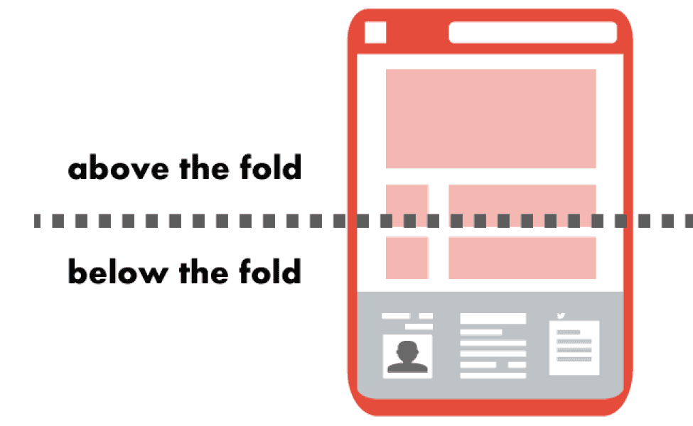
The term “above the fold” originated in the newspaper industry to describe the visible content of a newspaper, folded in half, on display at the newsstand. This concept is just as relevant to email: it refers to the content displayed before a user needs to scroll.
A study from the Nielsen Norman Group suggests that people spend 84% more time reading the content above the fold than below.
It is critical to ensure you have the crucial information above the fold, such as your logo, CTAs, and images with strong alt-text. The initial visible area varies across formats and devices but is generally 350 pixels high and 650 pixels wide on laptops and computers.
Next, you’ll want to encourage readers to keep scrolling down. Ensure the content is enticing and delivers what your subscribers want. Eye-catching images are a great way to incentivize readers to keep reading on. In order to find out what the image is about, the reader has to scroll down.
If you have a special offer, or a big product announcement, make sure the key information is above the fold. Otherwise, people may end up missing the point.
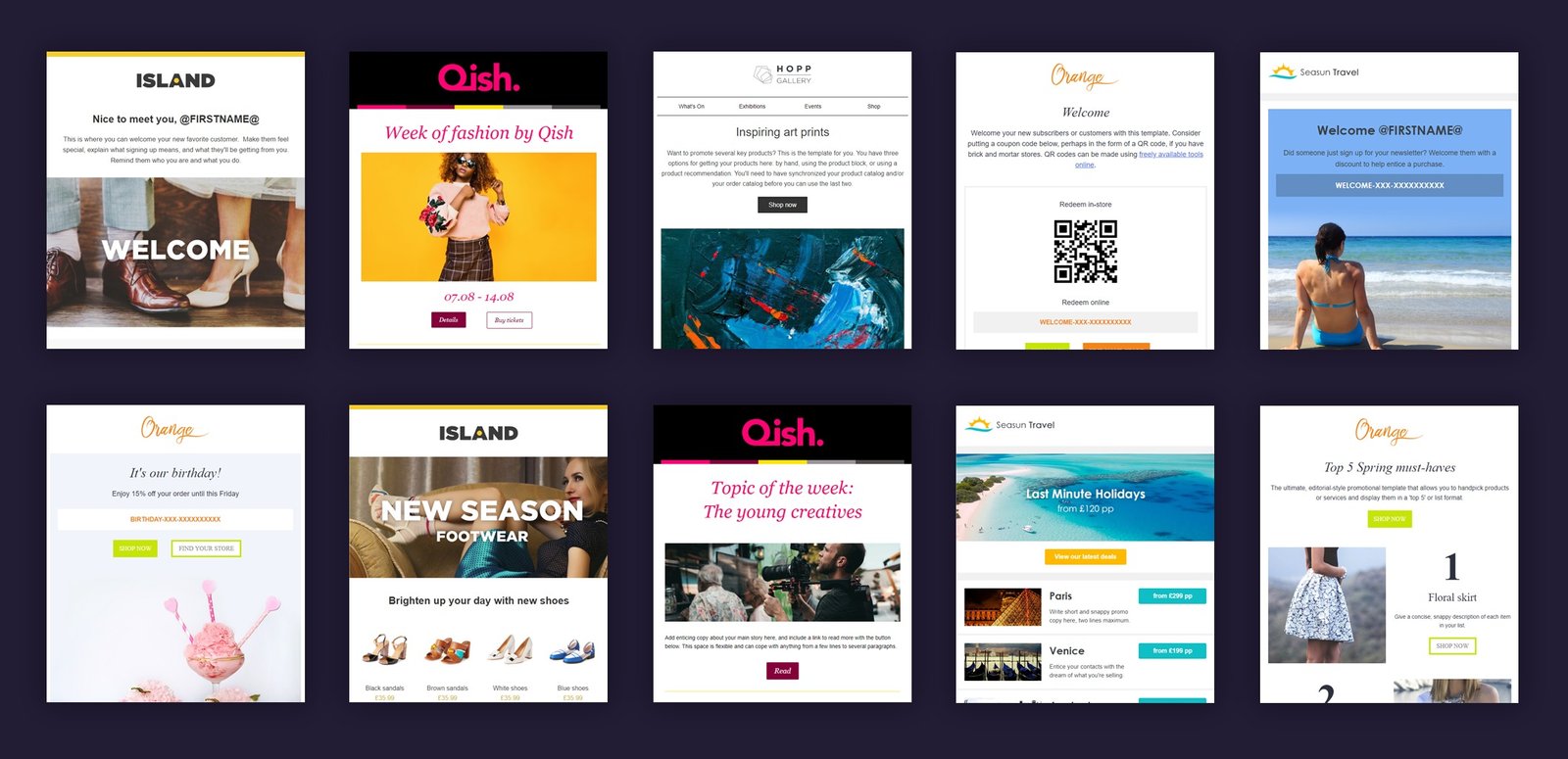
Layout
Layout is what most people think of when they think about email “design”. It’s the part where you decide where the pictures should go, how many columns you want, and whether you should have a navigation bar.
Ensure the layout is sympathetic to the content of the email. For example, if you were promoting multiple products, you might want to consider a navigation bar to help the subscribers jump to the ones they are most interested in.
However, there are email layout rules widely-accepted across most industries:
- Vertical: The vast majority of emails you receive will have a vertical layout, i.e. you read from top to bottom, which also happens to be the most popular format for subscribers.
- 500-650 pixels: This is considered to be the ideal width, compatible with most formats and devices.
- Single column design: Single column formats ensure your emails are optimized for mobile devices.
- Clear CTAs: No matter how much effort you put into making your emails look good, it is wasted if the call-to-actions are not clearly visible to the recipient. Highlighting them with a contrasting color typically works well.
If you nail the layout, subscribers can quickly scan your email for the information they seek, then easily click through to your site. Get the layout wrong, and readers will simply move on to the next email in their overflowing inbox.
Copy and Content Matters
The “Body Text” contains the bulk of your “content”. Assuming you’ve managed to entice the recipient into clicking open, follow these simple rules to help get your point across.
Ensure that you use a legible, web-friendly font – such as Arial, Courier New, or Georgia – and be consistent throughout. The point size should be 16px at a minimum. Most people can read this text size comfortably.
Consider increasing spacing in order to further improve the readability. Aside from keeping important content above the fold, you don’t have outdated, print-related restrictions related to how much physical space your layout consumes. Avoid the dreaded wall of text.
Use bullet points, colors, and bolds to emphasize key points and enhance readability. These are powerful design tools when it comes to maximizing readability. Don’t underestimate the part they can play.
Images: To Have or Have Not?
When used smartly images are a powerful addition and enhance the overall impact of the email. Studies indicate that people who hear information remember 10% of it three days later; add an image and this figure rises to 65%.
Bear these factors in mind when including images:
- Email Service Providers often block images by default: Many of your subscribers will not be able to see your images initially, since they have to give permission to their Email Service Provider (ESP) to display them.Therefore, it is critical to have alt-text in place. We’ll speak more about alt-text shortly.
- Compress your images: Ensure images are compressed. Failure to do this will adversely affect deliverability and how the email as a whole is displayed.
- Limit the number of images: Too many images and not enough content can lead to confused emails and a ticket to the dreaded spam folder. There is no magic formula but test and use your judgment to ask yourself, “Are these images enhancing the email?”
No doubt about it. Careful image management can significantly boost customer engagement and skyrocket your conversion rate.
PPI – What it Is and Why It Matters
Here’s an image management technique which can revolutionize the quality of your emails – retina images.
“Huh?”, I hear you say.
Let me explain.
“Retina image” is a relatively little-known term coined by the marketing department at Apple. They came up with a way to have better quality images without increasing the actual size of the file, utilizing high-density pixel per inch (PPI) images.
As a rule of thumb, retina images have twice as many pixels per inch than a standard image of the same size. This results in sharper and crisper images:
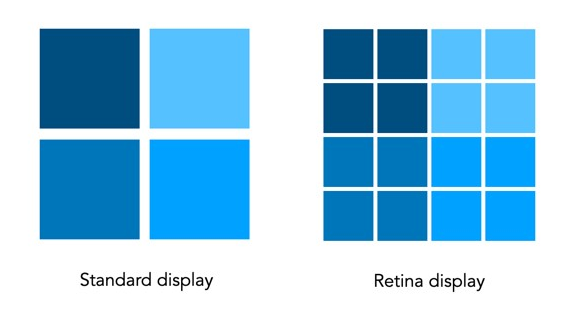
On certain devices, like an Apple iPhone, retina images allow the subscriber to zoom in without any loss of picture quality, due to the high PPI.
Alt-Text
Whatever image format you choose to use, it is always a good idea to have alt-text in place. Alt-text appears if the image fails to load properly and is very important if you are using it as a CTA. With this in mind, you should consider testing the email without images to ensure the alt-text is clear, and where necessary, clickable.
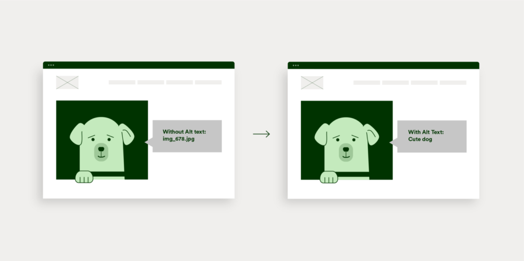
If you are formatting an HTML email yourself, you can manually add the alt-text in the image tag. This can be a little technical. You can also set up hyperlinks for alt-text in most email programs. This includes MageMail’s email design module, which offers our clients the ability to test for this before “hitting send.”
Last but Not Least
The footer, that bit at the bottom with the social media icons, contact information (including a physical address), and most importantly, the unsubscribe link, is an integral part of any marketing email.
I am subscribed to the Lonely Planet newsletter. They provide a great example of a footer encompassing all of these components. Starting from the top, we have social media “share buttons”, the option to download iOS and Android apps, and account management.
The “manage my emails” and “unsubscribe” links are key to making it past the spam filters. Without the unsubscribe link, your sender score will plummet. Even more importantly, it’s required by law.
So is the physical address. Even in a snail mail free era, this is also a US government requirement.
The Lonely Planet footer gives subscribers plenty of opportunity to both retain control over their communication with the brand and also click onto the site – after all, this is the ultimate point of any marketing email.
Take note of the simplicity. A cluttered footer is invariably an ineffective one. Ensure the design, overall, is in line with the branding and style of the website
Size Matters – The Importance of Responsive Email
With over 60% of emails being opened on mobile, it’s imperative to ensure your emails are “responsive” on multiple devices. With so many variations across different platforms, getting that right is easier said than done.
Addressing the varying screen sizes and resolutions on desktop computers, laptops, smartphones, and tablets isn’t enough. Another challenge email marketers face is that email clients, such as Gmail and Outlook, format emails for viewing in different ways.
That’s the challenge hybrid email aims to resolve.
Devised by Fabio Carneiro of MailChimp, hybrid email takes the concept of responsive email to the next level. And it doesn’t tackle the screen size issue alone. This can make it difficult, if not impossible, to address some of the finer points of email design. Keeping important content above the fold, and utilizing pre-headers are but two examples of best practices impacted by the end-user’s choice of email platform. Hybrid email implements coding that adapts to restrictions on the way your content is displayed across ESPs.
The hybrid approach is relatively new, and sophisticated coding may still be required, especially if your email layout is particularly complex. Ask yourself this question: “Is it vital for my email be seen, as intended, across multiple platforms?” Pay particular attention to Gmail. If the answer to this question is yes, hybrid email may be a solution for you.
Without a doubt, you should be optimizing your email campaigns for mobile. Whether you need to consider hybrid emails will depend on your target market, and whether it is worth the additional and effort.
Conclusion
Recent developments – including retina images and hybrid email – demonstrate there is still plenty of room for innovation left in email marketing. Stay abreast of new developments. Consider becoming an early-adopter of relevant ideas and technologies in order to give you a one-up on your competitors.
Sure, you might find the coding for hybrid emails too complex. There are professionals who can take care of this for you.
Always take a step-by-step approach when designing and optimizing your emails for maximum effectiveness.
High quality design doesn’t begin with the content of an email. It starts before it gets opened. A poorly designed subject line or pre-header may mean your email gets ignored altogether. What a waste of all your hard work.
From start to finish, subject to footer, pay attention to the details.
Focus on delivering well-designed email campaigns that boost your conversion rates, and your return on investment.