In this rapidly advancing digital world, the way we communicate has changed with it. Even Skype now looks positively ancient in comparison to the likes of Zoom and Facebook Messenger. In the workplace, services including Slack are becoming ever more popular.
Yet, the very first method of digital communication, email has stood the test of time. For businesses, it remains to be the most effective way to communicate with its customers, generating a return on investment (ROI) of $44 for every $1 spent.
From retail to real estate, B2C to B2B, and from the United States to the United Arab Emirates – email is King.
There’s no disputing the power of landing in the inbox of your customers and directly engaging with them. However, it pays to do it right.
Email newsletters have been the backbone of digital marketing teams around the world. It’s the only form of communication that allows complete control of your message. Getting the design right is one of the critical factors.
1. The Law
Given the recent introduction of General Data Protection Regulation (GDPR) by the EU in May of this year, there’s a renewed emphasis on how you manage your data. It incorporates every facet of email marketing, including the design of newsletters.
GDPR isn’t the only piece of regulation you need to be aware of. Individual countries are likely to have legislation that aims to protect the privacy of its citizens. To give you two key examples, here are the two main ones from the EU and the United States:
- CAN-SPAM Act: The CAN-SPAM Act covers all kinds of commercial email throughout the U.S. As noted on the official Federal Trade Commission website, this includes “any electronic mail message, the primary purpose of which is the commercial advertisement or promotion of a commercial product or service.” The law makes no exception for B2B emails. All marketing emails must comply with CAN-SPAM. For more information, reference the URL.
- GDPR: The General Data Protection Regulation (GDPR) is the most expansive piece of legislation of its kind, put in place by the European Union. It’s designed to protect the rights of all EU consumers. If you retain and process any Personally Identifiable Information (PII) from EU citizens, GDPR concerns you. Given that PII under GDPR can mean a website cookie or IP address, most online businesses will be subject to the legislation, regardless of physical location. Read our post on GDPR to know what this means for MageMail users.
It’s highly recommended that you either take the time to read these regulations or seek legal counsel. However, as we’ve detailed in a previous post, here are the four key factors when it comes to email marketing:
- List-Cleaning: Ensure you have a list of subscribers who are signed up to your emails and segment it so you can send targeted campaigns to customers in different countries, meeting each regulation.
- Content Production: Avoid simply promoting your products. Carefully consider, curate, and create content your subscribers would want to read to keep your email sender reputation up.
- Unsubscribe Button: Under CAN-SPAM, you must include an unsubscribe button or link with every email you send. Not including this could mean your emails going straight to the spam folder or even be penalized within the court of Law.
- Physical Address: Every commercial email should include a physical address that the business is registered to. Failure to comply can result in heavy fines.
You will now see how regulation can have an impact on email design. For example you need to find room to include a physical address and unsubscribe links. You shouldn’t simply treat these elements as an after-thought either. They are essential for good customer service and enabling your subscribers to retain control of their communication with your business.
Professional and well-thought-out design will ensure your marketing emails fall within the law.
2. Segment and Target
In one sense, the most important element of email newsletter design is ensuring your newsletter reach the right audience. This should be the foundation from which you build your emails, tailored for your targeted subscribers.
It has been proven time and time again that targeted emails see higher open rates than those which are not. Though this may seem obvious, only seven percent of brands included in a recent Experian survey use customer preferences to determine marketing channels.
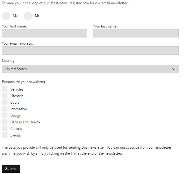
One of the best methods of finding out how your subscribers want to hear from you. Automotive brand Mercedes Benz do this brilliantly:
(Source: Mercedes.com)
This sets out the options subscribers can choose from. It’s all on one page, which makes it a quick an easy process. And it gets better:

(Source: Mercedes.com)
With the “personalize your newsletter” option, it gets even more specific. By setting out these specifications at the very beginning, you will be able to send highly targeted and personalized emails.
It doesn’t stop here. As you build your email list, you will want to identify “buyer personas,”
We use this term as a way to describe the different characteristics of your subscribers. By building a profile of your target audience, then be able to tailor your email design accordingly. The most efficient way of doing this is by conducting a survey that addresses the following criteria:
Who are they?
- Age
- Gender
- Profession
- Location
- Family status
- Income level
- Leisure time activities
- Education level
- Homeownership
What do they buy?
- What products they buy (If any)
- How often
- How do they use your products
Feedback
- Ratings
- Referrals
- Brand loyalty
As you can see, the emphasis is on the subscriber and ensuring you understand their interests and expectations. It’s important to realize that even though they may all be interested in your products/services, your customers are all individuals. By treating them as such, you will see your email engagement rate skyrocket.
3. Email Components
Now that we have looked at what you need to do to ensure the right emails reach the right audience, we can look at the different components of email design. As you’d expect, there are a number of considerations you should make:
- Objectives: You need to identify the objectives of your email newsletter. The design should ensure the information and message gets across to your subscribers.
- Resources: This will set out your budget and deadlines. Even though email does generate a great ROI, there will not be a bottomless pit of cash. State your budget and timing, and work to it. This will help you and your team focus.
- Subscribers: As we’ve set out in the first two sections, you need to consider who your target audience is. An email for pensioners will look very different from one aimed at youngsters, for example.
- Subject line: The subject line is critical for your open rate. It may not be “design,” but it’s an integral part of ensuring your email gets read by your target audience. 33% of subscribers decide whether to open an email based on the subject line alone.
- Content: The aim of email design is to make the content and information stand out. Nothing should distract the attention of your subscribers from the core message. So, before you get into the detail, make sure you know at least the draft outline of the email copy. This will guide you through the design process.
- Images. This incorporates any kind of imagery – whether it’s branding, headshots, logos, or videos. They will play a key part in any email design.
- Header and footer: Most successful email newsletters use smart headers and footers. This needs to be consistent with your brand and follow similar designs to your other marketing output. The header, for example, should use the same colors and style as your website. The footer is where you place all the necessary contact details and signature.
- Email clients: You should find out what email services your subscribers tend to use. For example, if the majority of your audience are using Gmail or Apple, then you can send image-led emails. For old Outlook users, a minimalist design may be more appropriate.
- House Style: With any content output, whether it’s your blog or emails, you need to have a house style. This will maintain consistency with branding and spelling across your business. For example, some people will spell “e-book” differently, and use “ebook” or “eBook.”
The list can feel overwhelming but each of these factors are critical to a successful email marketing strategy.
Take subject lines for example, which we covered in a recent post:
Here are the elements you need to consider and evaluate:
- From Name: People like to know who an email is from, so use a familiar name. This could be your brand or the CEO of your company. There is no need to be gimmicky here. Keep it simple.
- Subject Line: One of the trickiest parts of the process lies in writing a subject line that engages the recipient enough to make them open your email. All this, within 50 characters, and even less for mobile devices. (Notice the importance of subject lines and how it really plays a role in every aspect of email.)
- Pre-Headers: Many email providers have the preheader on as a default setting. This gives you another 100 characters to work with. Give your customers and prospects even more insight to what the email is going to be about.

(Source: Author’s screenshot)
Nike has mastered the art of subject lines and pre-headers. “You’re In” is a powerful message, following with “Thanks for signing up. Next…” .
Nike also managed to get their call-to-action (CTA) previewed in the pre-header with “Thanks for signing up. Next, become a member,” making it in just under the character limit.
Considering all these factors does seem like a lengthy exercise. However, once you and your team have set up and are comfortable with a process that suits your needs, then you can create a checklist to quickly go through. This will ensure you have everything you need to design your email newsletters.
Finally, we can move on to the email itself.
4. Header
The header is the very first thing you subscriber will see when they’ve clicked on your engaging subject line. Let’s take a look at a few real-life examples to see how it works:
(Source: Author’s screenshot)
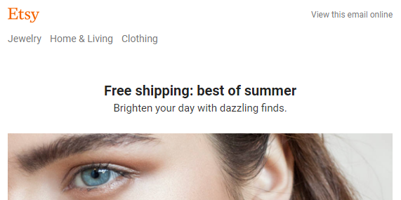
The other day, I received this email from Etsy. The overriding theme here is simplicity and branding. The recipients will immediately know who this email is from. The design follows the website layout as demonstrated below:

(Source: Etsy.com)
The e-commerce store maintains consistency, right down to the navigation bar. This makes subscribers and customers feel at home with this email and comfortable about scrolling through it.
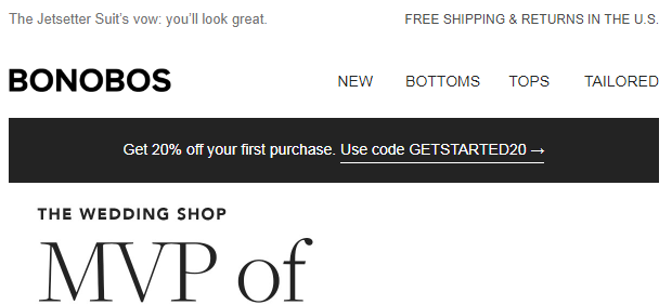
Other brands use their headers to share some of the benefits they offer. Bonobos, a leading men’s clothing retailer, follows Etsy’s approach with something extra:
(Source: Author’s screenshot)
You’ll notice the “pre-header” that includes not only the killer subject line but also “Free shipping & returns in the US.” This is the power of the preheader, where you can place that extra snippet of information to trigger your subscribers to make a purchase.
If there was one brand who fully combine using pre-headers and brand consistency, taking it to the next level, it would be Bloomingdale’s. First of all, here’s the email:
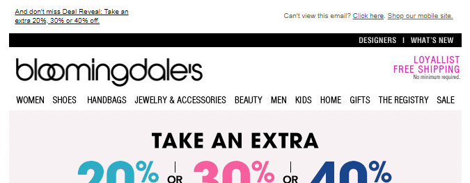
(Source: Author’s screenshot)
And now let’s check out the website:
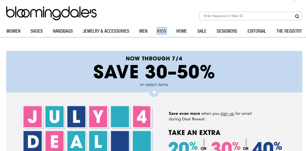
(Source: Bloomingdales.com)
Spot the difference?
If you’re fortunate enough to be working for some of the world’s biggest brands, then you could get away with simply using a logo:
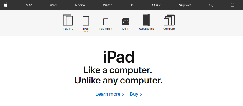
(Source: Author’s screenshot)
Apple is one such brand. A small image of the distinctive logo and the navigation bar is all it takes for the recipient to know it’s from the technology giant.
While most of us do not have the luxury of simply using a logo, the theme is clear. Simplicity and brand consistency is key when it comes to the header of your email. You should also look at the rise of the pre-header, which gives you the opportunity to show the benefits at the very moment your subscribers open your email.
5. Above the Fold
The first part of the layout you should look at is the content that’s displayed before the need to scroll. The term “above the fold,” has its origins in the newspaper industry, which described the visible content of a newspaper when folded in half on a newsstand.
Therefore, editors would put the main headline just below the title of the paper, so readers can see what the main story is. This logic is just as applicable to the world of email marketing.
A study from the Nielsen Norman Group suggests that people spend 84% more time reading the content above the fold than below.
What does it mean for you?
As a marketer, it’s important that your subscribers read the information you want them to read. So, in terms of email design, you’ll need to ensure all the crucial details such as the title, logo, and main CTA are all visible before the need to scroll.
Let us show you what we mean:

(Source: Author’s screenshot)
This is how not to do it. Airbnb created a great email, which was very topical at the time of the soccer world cup and uses a very engaging image.
However, in order to fully understand what this email is about, you needed to scroll down.
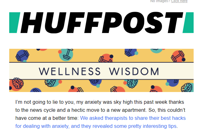
(Source: Author’s screenshot)
The weekly newsletter from HuffPost is a good example of a brand utilizing the “above the fold” principle. It’s a simple design, starting off with the title of the post which is immediately familiar with its subscribers. The first paragraph is entirely visible before I have to scroll, so I get to see what kind of newsletter I should expect.

(Source: Author’s screenshot)
Travel magazine, Lonely Planet have a track record of creating well-designed and clean marketing emails. This example is no different.
The no-fuss approach is highly effective here, with the title setting out exactly what this email is about. Supported by an attractive image of Cambridge, UK, the subscriber will be tempted into scrolling down to find out more.
You need to find the balance of giving enough information to entice your subscribers to read on, but not too much so they can simply bounce back out again.
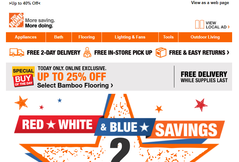
(Source: Author’s screenshot)
This email from Home Depot strikes a different tone to the previous two examples, but it follows the same principle. All the key information the subscriber needs to see is immediately visible. There’s little doubting what the core message which is essentially, “there’s a sale on, buy now!”
It’s worth remembering that the visible area varies from device to device, but is generally around 350 pixels high and 650 pixels wide on laptops and computers.
6. Footer
We briefly talked about the footer earlier on in the post and about how it can be used for branding and contact details. As your subscribers scroll to the bottom of the post, the footer is likely to be the last thing they’ll see, so it’s critical to make an impression.
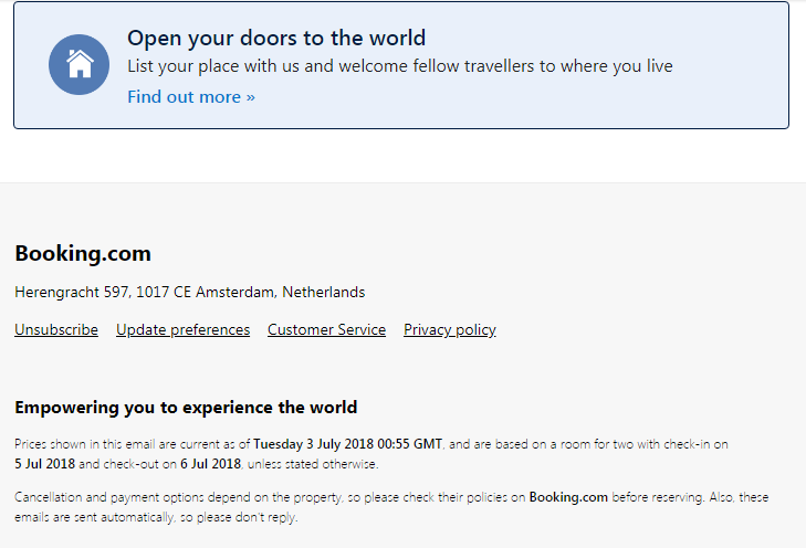
(Source: Author’s screenshot)
Booking.com’s footer contains all the key contact details and legal information. Alongside this, the brand manages to take the opportunity to make a secondary promotion. This is important because it will not distract from the main purpose of this email, which is to sell hotel rooms.
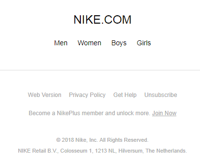
(Source: Author’s screenshot)
Sports apparel brand Nike goes for an even simpler approach with its footer, including a mini-navigation bar and invitation to become a member.
Carefully designing your footer will allow you to present the “boring” details of contact and legal information in a clean and concise way. You should take the opportunity to leave a positive impression on your subscribers by tying it in with the overall layout of your email.
7. Layout
We’ve looked at the individual components of a marketing email such as the header, footer, and the part that’s above the fold. Now we need to see how you can bring it all together.
You need to consider:
- Where the images go
- Visibility of your brand
- Whether you should have navigation bar or menu
The key is to understand the core purpose of your email, what the content will be, and who your audience are. There will be subtle differences depending on your requirements. However, there are some key rules that apply across the board:
- Vertical: The vast majority of emails you receive will have a vertical layout, i.e. you read from top to bottom, which also happens to be the most popular format for subscribers.
- 500-650 pixels: This is considered to be the ideal width, compatible with most formats and devices.
- Single column design: Single column formats ensure your emails are optimized for mobile devices.
- Clear CTAs: No matter how much effort you put into making your emails look good, it is wasted if your call-to-actions are not clearly visible. Highlighting them with a contrasting color to your background typically works well.
The Washington Post adheres to each of these factors with this email:
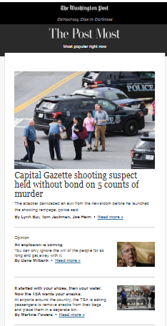
(Source: Author’s screenshot)
The single column approach works well here, as the recipient simply must scroll down to find the latest news stories. The design allows space for text, images, and CTAs which enables readers to jump straight to the article of their choice. The overall layout means the email is easily navigable and subscribers can quickly scan through.
If your e-commerce store has multiple products across different categories, then you may wish to use two columns:
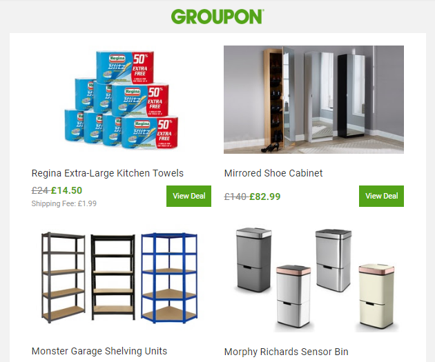
(Source: Author’s screenshot)
As you can see, Groupon uses a grid system to present its special deals. This design maximizes the number of products that can be clearly displayed. It’s entirely different from the Washington Post’s content-led approach.
Yet, both these designs work for the two different brands. Let’s take a look at another email layout that works for charity:water:

(Source: Causevox.com)
The image-led layout works well for charitable organizations who are seeking empathy from subscribers. Supporting the main image with concise text drives home the message that “Water is Life.”
The point here is to set your layout to the purpose of your email. Before you do anything in terms of design, take the time to understand the subject, core message, and your audience.
8. Email Copy
This is an often overlooked element of email design. The font of your text matters more than you might think. Certain fonts do not format well on emails so you should stick to Arial, Georgia, or Helvetica. This will ensure your content will be legible to your subscribers. The size should be at least 16px which works in most formats and readable for mobile users without needing to zoom in.
The layout of your text also makes a difference. No-one wants to read a “wall of text” which can lead to fatigue and your subscribers leaving your email and not coming back.
Therefore, use bullet points, headings, and color to break up your email into scannable sections.
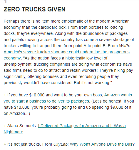
(Source: Author’s screenshot)
The daily briefing from Dave Pell’s excellent Next Draft blog follows the plain text format, complete with headings and bullet points. As you can see, the font is easily legible and subscribers will be able to skim through in seconds. It’s an excellent example of how text-only emails can be just as engaging as image-led versions.
There should also be an emphasis on the main message your business wishes to get across. One of the most effective ways of doing this is using a CTA:
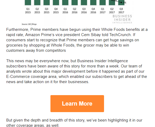
(Source: Author’s screenshot)
This newsletter from Business Insider utilizes the CTA with great effect. First of all, it’s right in the middle of the copy, so it simply cannot be missed. Secondly, the company uses a completely contrasting color to the rest of the email, which enables the CTA to stand out.
A couple of other tricks you can do to drive home your core message is to use bold or color within the copy. The key is not to do it too much, as overuse will reduce the effect on the reader.
9. Images
There’s no doubt that images, when used right, can significantly boost the engagement rate of your emails. Numerous studies show that people who read information remember 10% of it three days later; add an image and this figure rises to 65%. In addition, humans can also process visuals up to 60,000 times faster than text.
Clearly images work. So how to use them right? Follow these steps that we set out in a previous post:
- Email Service Providers often block images by default: Many of your subscribers will not be able to see your images initially, since they have to give permission to their Email Service Provider (ESP) to display them from you. Therefore, it is critical to have alt-text in place. We’ll cover more about alt-text shortly.
- Compress your images: Ensure images are compressed. Failure to do this will adversely affect deliverability and how your email is displayed as a whole. In MageMail’s easy-to-use WYSIWYG editor, images are optimized and sized to fit accordingly.
- Limit the number of images: Too many images and not enough content can lead to confused emails and to the spam folder. There is no magic formula but test and use your judgment to ask yourself, “Are these images enhancing the email?”
Some of the best emails we’ve seen follow each of these principles:

(Source: Author’s Screenshot)
Men’s shorts brand Chubbies is another one that nails email marketing. It knows who its audience is and what makes them tick. In this case, celebrating 4th July, Chubbies use plenty of images to show how others mark the occasion. The result is a highly engaging email that generates engagement and excitement among its subscribers.
This is how you use images in the right way.
What is Alt-Text?
We briefly mentioned that ESPs tend to block images by default, though most of them do offer the option to enable images at a click of a mouse. Having said that, it’s critical to have alt-text in place.
Alt-text appears if the image fails to load properly, as we’ve demonstrated below:
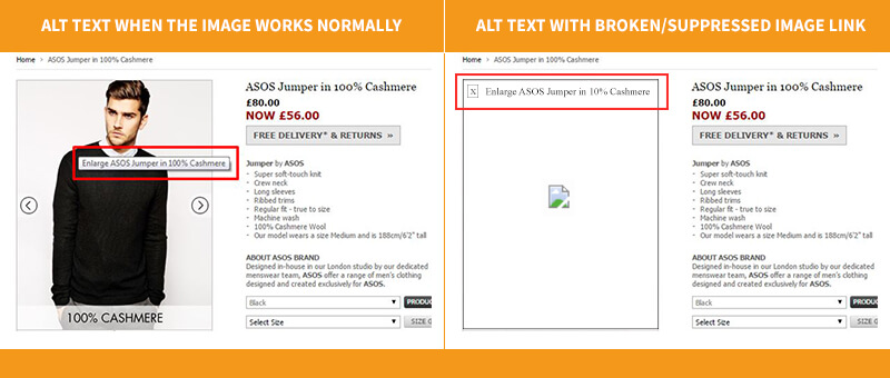
(Source: Author’s screenshot)
When designing your emails, imagine a scenario where the images do not load and the recipient wants to know what these blank boxes are. So in this case, we have an image displaying a cashmere sweater. In the alt-text, you’d need to write something like: “Men’s cashmere sweater.”
It doesn’t need to be a complex exercise. Alt-text should simply describe what the image is, and let the subscribers know it’s safe to load. In the cyber-security conscious era, this will be an invaluable addition to your email design.
10. Mobile
Last but absolutely by no means least. We’ve seen a huge surge in the number of emails being read on mobile devices, accounting for 47% of opens by the end of 2024.
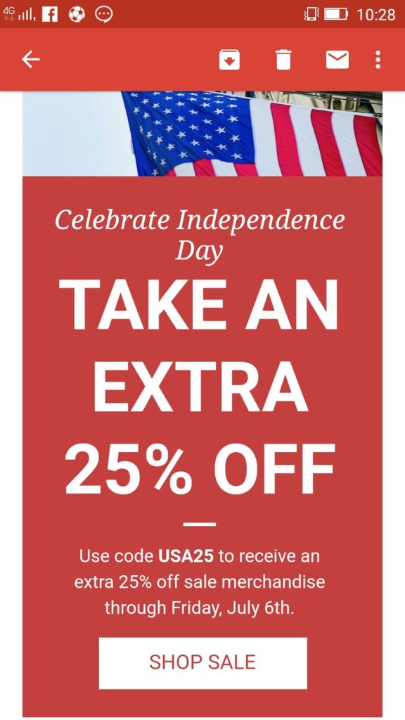
The key is to follow the single column design and leave plenty of space between the CTAs. You need consider legibility and how people can navigate through your email on a small smartphone screen:
(Source: Author’s screenshot)
Leather goods store Ghurka regularly send mobile friendly emails. Short, simple, and easy to click on, it’s a winning combination. The CTA in this case is large, with plenty of space for human thumbs. The content is easy to read and the screen isn’t taken over by an oversized image.
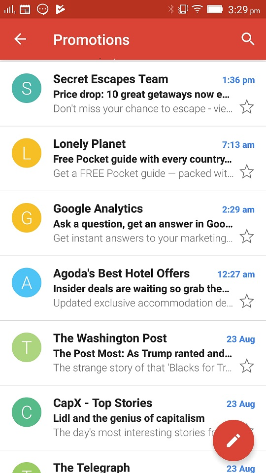
Mobile email design also starts the moment it lands in the inbox. For laptops and desktops, the character limit on the subject line before it gets cuts off is around 50.
On mobile devices, it’s more like 20:
(Source: Author’s screenshot)
Here’s how emails are typically displayed on smartphones. You’ll notice that most brands find their subject lines have been cut off at some point – with the exception of CapX. Therefore, it’s imperative that you begin your subject line with the key information that sets out what this email is about. If subscribers do not know, then they are less likely to open it – putting all your great design work to waste.
Conclusion
There you have it. We’ve taken you through the entire process of designing marketing emails. Right now, you’re probably thinking “Woah, this is too much!” or simply don’t know where to start.
Though this is a long post and can feel a little overwhelming, we’ve just taken the time to go into the detail and explain why each step is important. In a nutshell, the process works like this:
- Identify your target audience
- Get the content of your email and the core message
- Add images
- Design the layout and insert the content within
- Come up with a killer subject line
- Ensure it’s mobile-friendly
- Send!
The key is to understand that email design does not simply start and finish at the layout. It needs to be involved at each step of the process. After all, how can you come up with a layout without knowing what the content is or who your subscribers are?
Email marketing is as strong as ever. The potential ROI of $44 for every $1 spent is within reach, if you approach newsletter design in the right way.
