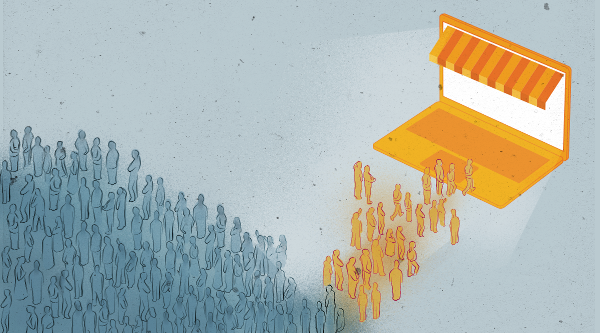
In a perfect world, you’d want every visitor to your site to make a purchase. The reality is that a very low proportion of website visits result in a sale. There isn’t an exact conversion rate average in e-commerce, simply because there are too many variables, and it all depends on what industry you’re in.
For example the travel industry median conversion rate is 5% while real estate scores 2.8%. However, a conversion rate of around 2.5% can be considered as a vague global average.
We suggest that you should not rely on these industry averages. Instead, focus on taking the steps to improve the current conversion rate on your own site. Even if you are satisfied with your store’s performance, there’s a chance there is even more you can do.
Images
For e-commerce stores, the quality of your images can make or break a sale. Science has proven time and time again that we are more receptive to pictures than written content. The human brain can process images 60,000 times faster than words. There’s also the obvious benefit of being able to see what the products look like.
One leading brand that understands the power of images is the Dollar Shave Club.
The imagery on the main product page is clean, sharp, and simple. The light background help to bring out the color. The layout of the shaving kit means the site visitor can see exactly what each part is. There is no need for too much descriptive content because the picture says everything.
The crisp use of images continues into the individual product pages.
The default main image of the razor is once again clean and sharp, with minimal content to distract the focus. Essentially, Dollar Shave Club is using pictures to sell the product. And it works.
The brand showed much success, it was bought by international conglomerate Unilever for $1 billion in 2016. An extraordinary achievement considering it was founded only five years prior to the deal.
Product Descriptions
Even the best images need descriptions. The key is to let customers know what the product does and what benefits they can get from it. There are some rules you should remember:
- Write your own: Don’t rely on a standard description from the manufacturer. There are two reasons for this:
- Uninspiring: You want to entice the customer to buy your product. A standard description could be dull and fail to reflect your brand.
- Duplicate content: Using the manufacturer’s descriptions means you are at risk of being penalized by Google for duplicate content.
- Make it scannable: Ensure the description is easy to read and takes no longer than a few seconds for the customer to get the idea. Use bullet points and headings to break up the text.
- Tailor it to your audience: Keep your market in mind when writing the description. If you have the right audience, don’t be afraid to include a bit of humor.
- Optimize for SEO: Search engine optimization (SEO) can prove effective for driving traffic to your site. While it may not improve your conversion rate, it can bring in extra revenue for your business. So it makes sense to make your product descriptions SEO friendly.
- Spell check: This may be a basic requirement but it’s very important. Customers will notice and mistakes can make your business look unprofessional.
Ladies clothing and accessories retailer, Shopbop, checks all the boxes with its product description. Using minimal content, it details the color, size options, and a brief sentence to add a bit of flourish. If the customer does want to know more detail, the option is there with the “Show more” tab:
The lesson to take away here is that it’s possible to give all the information a customer needs with minimal content.
New York based electronics store, BH Photo Video, has an excellent site overall. For goods like laptops or cameras, customers tend to require more information than they would for things like clothes.
BH Photo Video knows this, and make its specialist knowledge one of the key selling points of its products. It also presents the wealth of information on each product in a smart way. To begin with, all the key information and rating is visible without scrolling. Scanning down the page, you see different tabs for further details.
When you click on the overview tab, you are taken to a detailed description of the selected product.
This approach is a great example of how a brand needs to keep the audience in mind when creating product descriptions. Longer-form content would not work for an apparel store, but it’s perfect for people interested in electronics, in this case laptops.
Free Shipping
Ever since Amazon introduced free shipping, it has become the norm in e-commerce. A survey found 90% of customers say free shipping was the number one incentive for shopping online.
This does pose a challenge for small-to-medium businesses who operate on small margins. Incorporating shipping costs into your expenditure can affect your bottom line.
There’s a way around it. Pass the cost of shipping into the overall price of the product and set a threshold on orders for free shipping.
NuFace was one brand that faced this problem. So they began to offer free shipping on orders above $75. The results were overwhelmingly positive. Its orders rose by 90% after the threshold was introduced.
That wasn’t the only positive thing; the average order value increased by 7.32%. It may be a simple psychological trick but it works.
Abandoned Cart Emails
The cost of shipping is a leading cause of abandoned carts. The widely-respected Baynard Institute indicates that the average cart abandonment rate stands at 70.22%.
In this blog post, we pointed out that this equates to an eye-watering $4.6 trillion being left on the table each year. Yet, $2.5 trillion of that is recoverable.
One of the most effective ways of recovering abandoned carts is automated emails. They have an average 48% open rate, higher than any other form of email marketing.
Statistics also suggest that emails sent within 20 minutes of a customer leaving the checkout process have a 5.2% conversion rate.
At MageMail, we offer our customers the ability to send automated abandoned cart emails. Take a look at this example from one of our clients, Gogoprint.
In this case, a customer “Bob” had added received this email with a friendly reminder of the product they selected. It adds a personal touch by coming from a Customer Service Executive, and if they have any questions about the product to respond back. Giving the impression
The first abandoned cart email is the one with the highest chance of bringing the customer back. However, we recommend to sometimes send two more emails, if the first abandoned cart email doesn’t succeed.
Simple and Clear Checkout Process
Sticking to the abandoned cart theme, the checkout is a significant factor. Once those “just browsing” are taken out, 28% of shoppers abandon carts because of a “complicated checkout process.”
There are two approaches you can take here. One is the single page checkout, where you place all the fields required into one page, like Bellroy.
This is an excellent way to secure a high conversion rate. Shoppers can see the whole checkout in one page and that it’s not a lengthy process. All the information on the product is there together with the total costs. Bellroy also offers multiple payment options which gives the customer even less of an excuse to drop out.
Though Bellroy has found a way to fit the whole process onto a single page, it’s not always possible to achieve. A second approach is to have a progress bar along the top of the checkout.
Amazon uses the progress bar to reassure shoppers that there are only four steps in the entire process. If customers know exactly what to expect, then they are more likely to complete their purchases.
We believe if it’s good enough for Amazon, then it’s good enough for any brand.
Mobile Friendly Sites
This is one area where there’s still a real opportunity to get ahead of your competitors. A recent Statista survey found that over half of all web traffic in 2025 were from mobile devices. Yet, by the third quarter of 2024 mobile only accounted for 23% of all e-commerce spending in the United States.
The fact 83% of consumers expect a seamless experience across all devices shows the importance of mobile responsive sites. Despite the clear demand, 15% of small businesses in the US did not have a mobile friendly site in 2025.
Apparel store, American Eagle Outfitters, is one of the top ranked mobile sites according to Baynard. It’s easy to see why, with the easily navigable sections and clear images of the products. The drop-down menus are large enough for your thumb to click on but not too big that it takes over the page.
American Eagle Outfitters have made significant inroads into providing a mobile friendly checkout.
One of the key elements here is that the whole process is on a single, scrollable page. The fields are all once again big enough for thumbs, while there is a chat icon ready to provide support, making it a super-friendly user experience.
It can be a difficult art to master, but American Eagle Outfitters is leading the way in mobile e-commerce.
Utilize Product Reviews
There’s been a buzz around the value of user-generated content for a while now. That’s because it has proven to be extremely effective for e-commerce stores. With 82% of customers looking to read at least three product reviews before making a purchase, it’s time to embrace them.
To take a look at an exceptional use of product reviews, we need to go to Amazon.
The nearly five star rating is clearly reassuring for shoppers who might be interested in this package. It also indicates a high level of engagement with the brand.
The other great thing about customer reviews is that they describe the product in real-world conditions. It allows shoppers to build a picture in their minds about how it can fit into their own lives.
Of course, not every review will be positive. It’s important to respond to any constructive criticism and use it to improve your own products. Ensure that you share any positive outcomes on your site or on social media.
The bonus of user-generated content is that it can boost your search engine optimization (SEO). It enables your site to rank for a greater variety of keywords and terms.
Bold, Clear Call-to-Action (CTA)
Having a bold, clear CTA can be a more difficult challenge than you’d expect. There may be styling issues or more than one CTA on the page.
The trick is to focus on one main CTA and make it stand out as much as you can.
Outerwear brand, Patagonia, nails its CTA on the product page with the “Add to Cart” button. The orange is in sharp contrast to every other color visible on the page.
There’s no hiding what the focus of the page is. To convert visitors to customers.
Conclusion
E-commerce has grown exponentially in recent years, so it can be easy to forget there is even more revenue to be made. Now a multi-trillion dollar industry, any gains in conversion rate could prove highly lucrative for your store.
Abandoned carts alone cost online stores around $2.5 trillion a year in recoverable revenue. Those numbers are not to be sniffed at.
Embracing email as one of the key components to your marketing strategy. For abandoned carts, it has been proven to be one of the most effective methods in recovering lost revenue. Ensure the first email goes out within 20 minutes of the customer leaving their cart to maximize the chances of a purchase.
There’s also plenty you can do on the site to increase your e-commerce conversion rate. Essentially, treat your site as a funnel to drive visitors from the product pages to the end of the checkout process.
Start with eye-catching, clean, and simple images. Minimize any unnecessary distractions from the products. The descriptions should also be thoughtfully laid out, and where possible, concise. Create your own content instead of relying on the standard descriptions of manufacturers.
The checkout process itself should be as smooth as possible. If you cannot fit it all into one page, then consider a progress bar to let the shopper know which stage they are at.
With free-shipping so widespread, not offering it can kill your conversion rate. If it will affect your bottom line, there creative ways to incorporating the additional costs.
And finally, mobile shopping is here, and it’s here to stay. Get ahead of the game now and make your checkout process mobile responsive as well as your site.
There’s clearly a lot you can do to boost your e-commerce conversion rates. It can take a little inventive thinking, your own intuitive, and a can-do spirit. Even if you feel your online store is performing, there’s always more to do.